Seolta Spirits’ Die-Cut Label Lets Its Scottish-Style Rum Shine
By
Published
Filed under
By
Published
Filed under
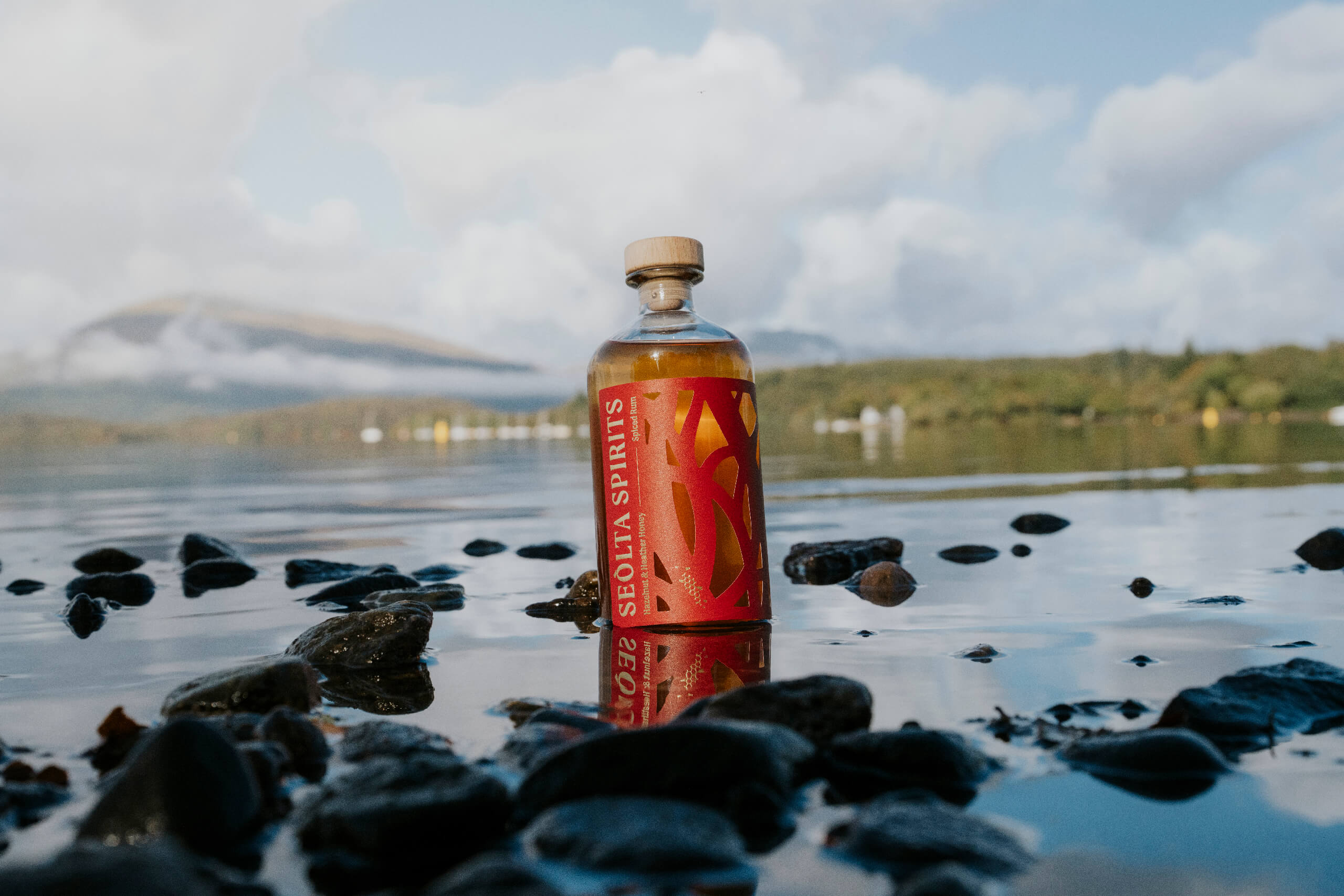
Designed by My Creative, Seolta Spirits’ packaging leans on a striking wrap label that makes me think every label needs to be die-cut. The deep red panel is sliced into winding shapes that allow the bottle’s amber color to come through, turning the spirit itself a critical element of the design.
A narrow vertical typographic layout keeps the brand name clean and legible while letting the label take over the visual field, as it should. The matte paper texture contrasts with the glass, giving the bottle a tactile presence without overwhelming it.
Get unlimited access to latest industry news, 27,000+ articles and case studies.
Have an account? Sign in


