Run of the Mill Isn’t a Real 200-Year-Old Vodka Brand, But This Convincing Concept Had Us Fooled
By
Published
Filed under
By
Published
Filed under
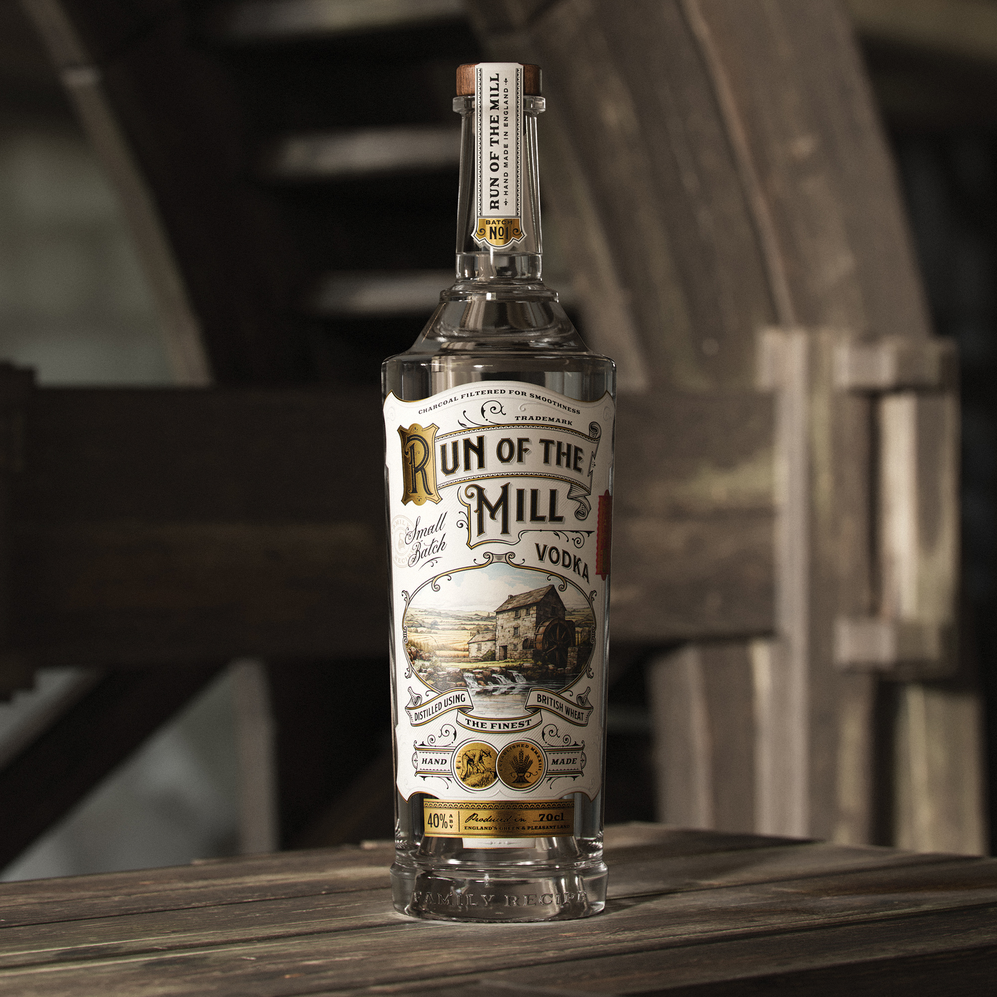
There will always be something appealing about an object that looks lost in time—especially in a moment where people seem to be hungry for packaging with a vintage feel, like retro coffee tins and old-fashioned liquor bottles. Designers Dusan Sol and Amit Chippa imagined a legacy vodka brand that looks so natural, we could easily imagine their bottle design popping up in an old movie.
Run of the Mill comes in a gorgeous bespoke bottle, printed with classic serif text and a cute little distillery icon at the bottom. Gold foil, swirly, old-school fonts, ribbon detail, and rural illustrations effectively paint the picture of an almost 200-year-old English mill that we imagine would be a hell of a tourist destination for vodka lovers—if only it were real!

Get unlimited access to latest industry news, 27,000+ articles and case studies.
Have an account? Sign in


