
Estúdio Kuumba’s packaging design for Pitz, the potato snack brand from Brazil, is captivating. With a focus on engaging young audiences and delivering an artisanal touch, each Pitz tube tells a unique story through illustrative characters and humor, offering consumers an unforgettable experience. The packaging celebrates individuality and creativity with its diverse and colorful characters, reflecting the brand’s bold and cheerful visual identity. Pitz’s tone of voice, relaxed and authentic, keeps the brand up-to-date with cultural trends and ensures an ongoing and relevant conversation with its dynamic community of consumers.
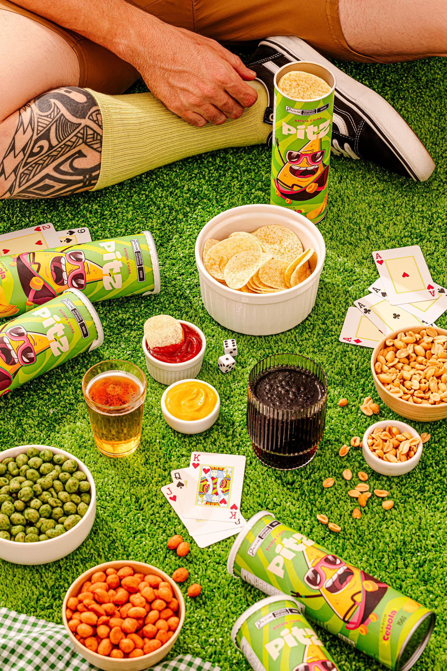
Pitz is a vibrant potato snack brand originating from Brazil, aimed at creating an authentic and inspiring experience. Designed to cater to the universal munchies with an artisanal touch, Pitz is more than a snack; It is an audacious combination of flavor, color and energy, aimed mainly at young audiences. The goal was to design a unique label that would not only capture attention on the shelves with its distinctive look, but also resonate with an innovative personality and concept. We wanted each package to tell a story, expressing flavor through illustrative characters and humor, thus creating a distinctive dialogue with consumers.


