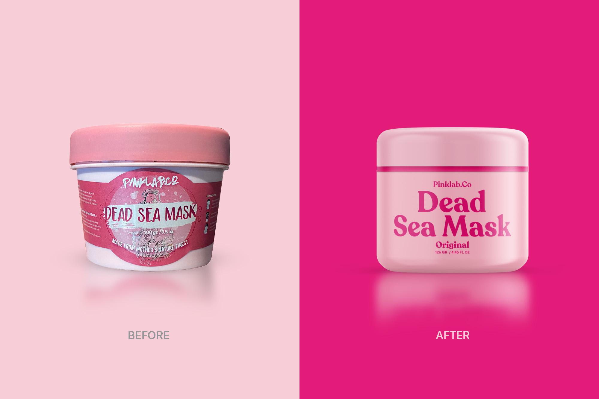
Pinklab.Co’s New Packaging System Keeps The Pink But Simplifies The Rest
By
Published
Filed under

By
Published
Filed under

Widarto Impact worked with Pinklab Co. to simplify the brand’s packaging system. While the pink-based packaging remained intact, the new, simple system leans into a type-driven design, making it easier for the brand to connect with its consumers. In addition, the updated design is much more digestible, legible, and easier for consumers to recognize the brand quickly.

Pinklab.Co is a proud beauty brand that believes that nature is the solution to every skin problem, especially for women. One of its most popular products is the Dead Sea Mask, which is sourced from the finest quality Dead Sea for the benefit of beautiful skin. Over time, Pinklab.Co experienced the challenge of lacking brand strength in a visual identity that represented Pinklab Co as a whole. Where this makes Pinklab.Co easily rivaled by other brands even with lower selling prices. With a vision to expand its market reach internationally, Pinklab.Co wanted to turn its basic identity into the brand’s main foothold.
Get unlimited access to latest industry news, 27,000+ articles and case studies.
Have an account? Sign in