THIS IS IT! DIELINE Awards 2026 Late Entry Deadline Ends Feb 28
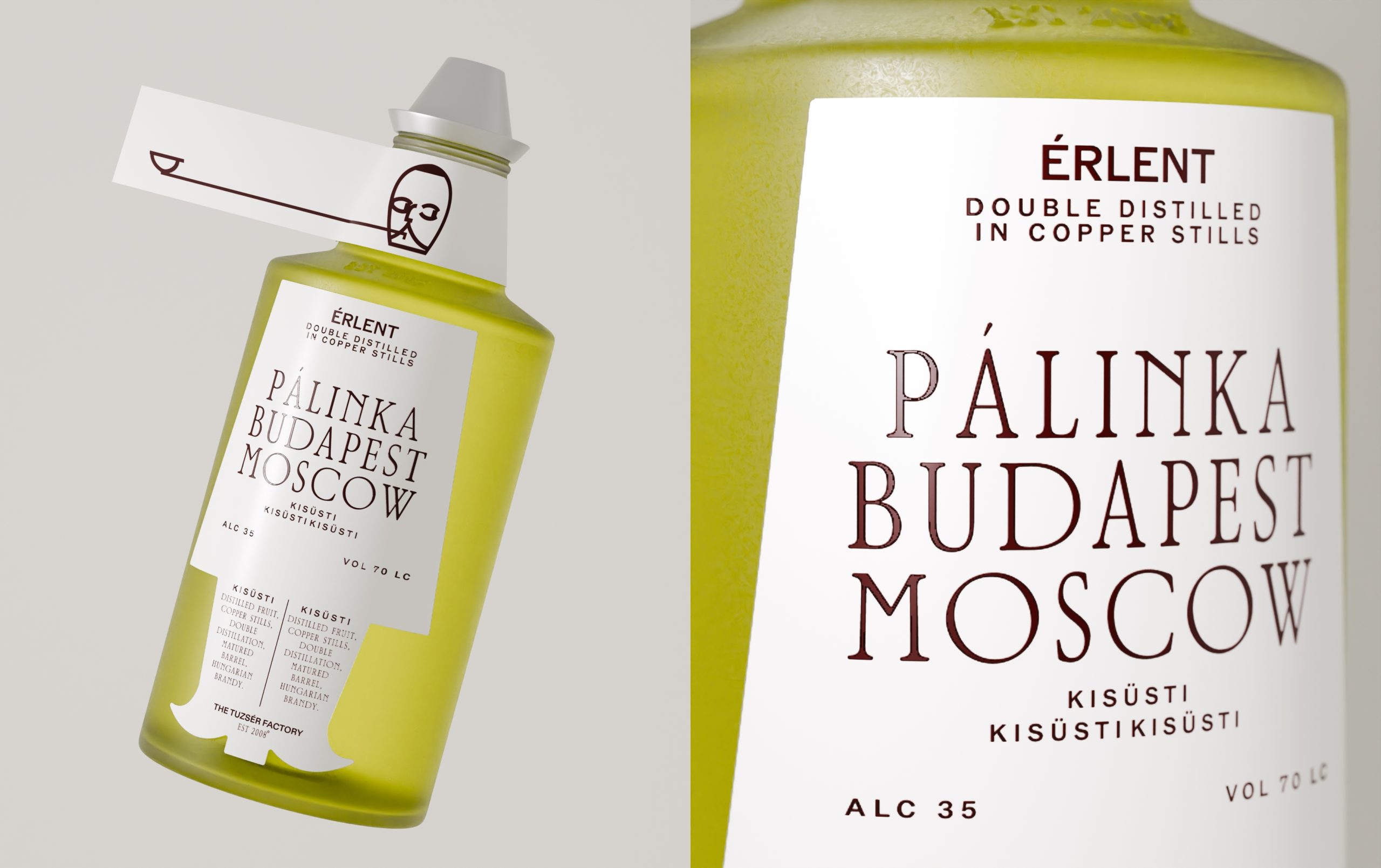
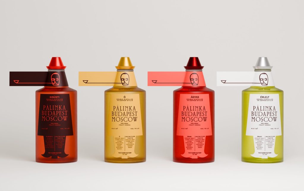
Pálinka Bottles Up Budapest Without Getting Hung Up on Tradition
By
Published
Filed under
By
Published
Filed under
The squat bottle and horizontal neck tag look like industrial seals and archival labeling instead of a folkloric ornament. Evgeniya Tsoy’s concept packaging for the fruit vodka PÁLINKA pairs a crisp serif typeface with interesting spacing. The colors move from oxidized reds to apple greens, mapping fruit character and maturation, while the minimalist line illustration makes the category look intellectual, not rustic.
Get unlimited access to latest industry news, 27,000+ articles and case studies.
Have an account? Sign in