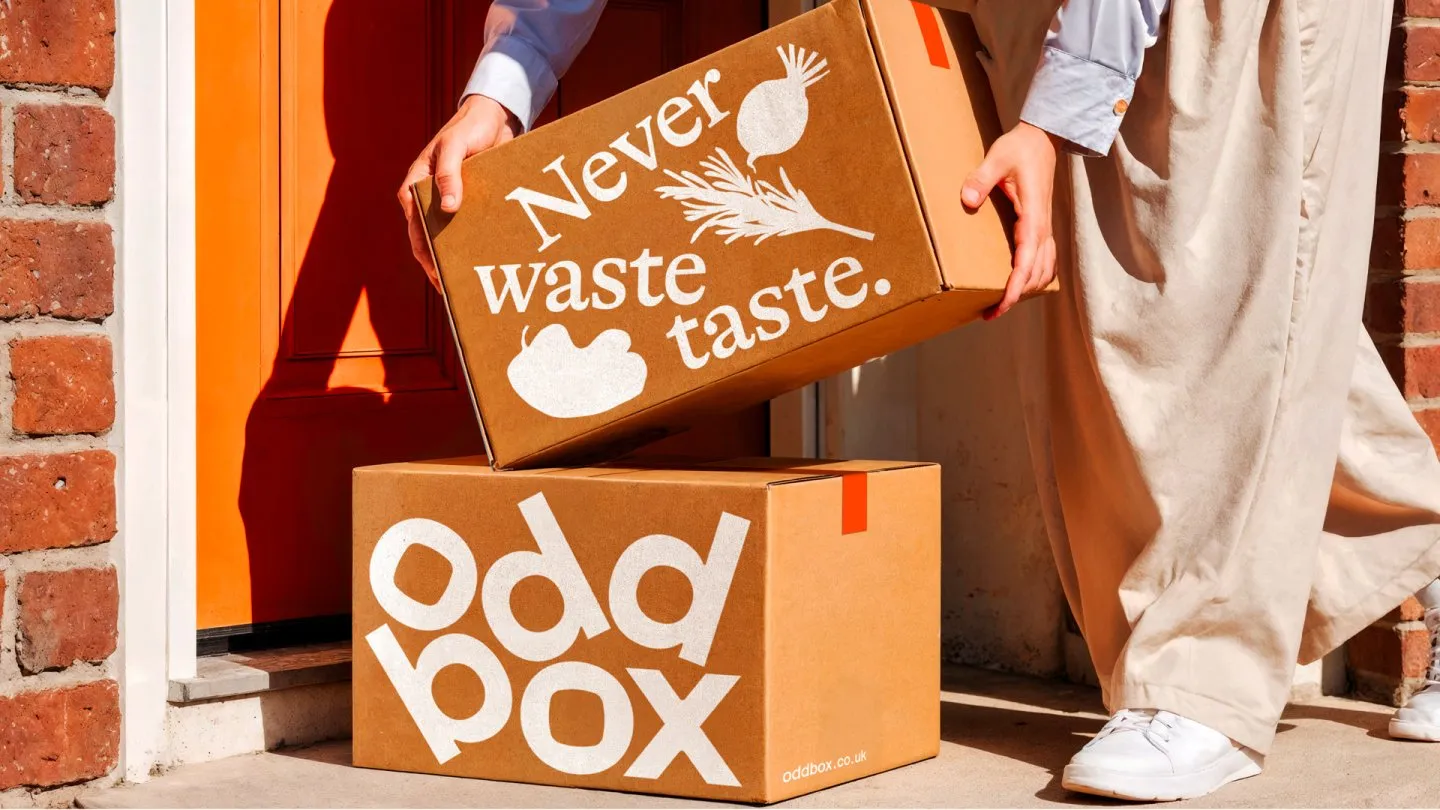
- Oddbox’s rebrand by Kuba&Friends uses oversized, cropped typography for headline-style impact
- Kraft materials are paired with sharp white type and a new orange palette for modern contrast
- Screen print-like produce icons make the brand stand out from typical eco grocery aesthetics
If you thought produce branding stopped at beige, Oddbox is rewriting the rules.
The brand’s refreshed packaging, designed by Kuba&Friends, goes bigger and far more confident than most do-good brands dare. The typography is oversized and deliberately cropped, like tabloid headlines that make rescued produce sound urgent and cool. On the kraft boxes, the sharp white type keeps the message direct, while the orange signals a brand that is not playing it safe.
