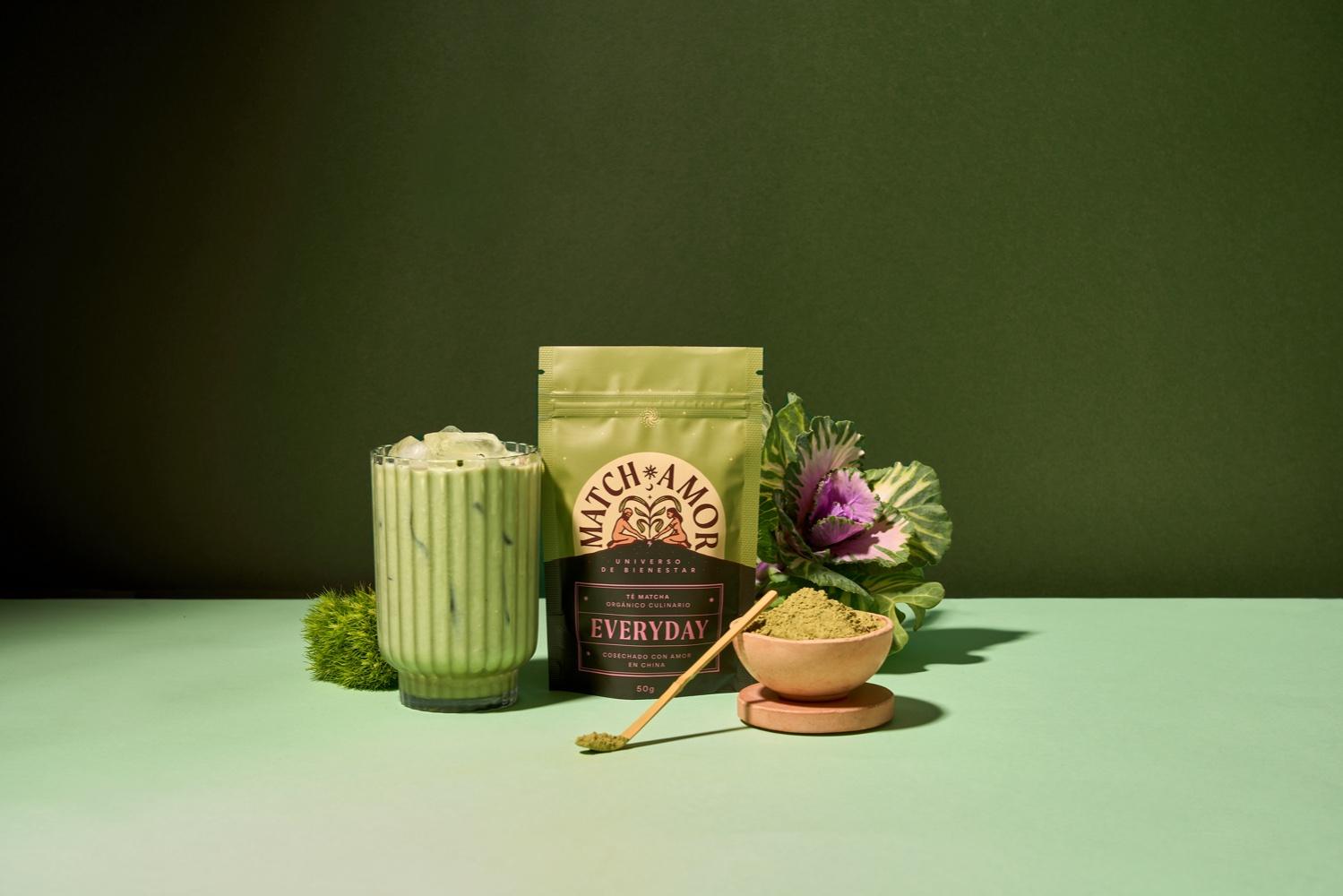
Invade design recently worked with the wellness brand Matchamor to redesign the brand’s packaging. The match is now packaged in a pouch that feels both earthy and organic, but when paired with bright colors and a more modern typeface, the result is a packaging system that feels utterly contemporary. Plus, the almost tarot card-inspired illustrations continue the organic approach while creating a storytelling, immersive experience for consumers.
![]()
Is anyone around here looking for their perfect match? Say no more! We’re glad to introduce you to matchamor.co, a Colombian brand dedicated to sharing a wellness universe through tea and herbal blends. Matchamor founders came to us looking for a brand redesign and the first thing that came to our minds was: how do we preserve the brand’s essence and simultaneously broaden its possibilities beyond the matcha field? considering the word matcha is embedded in the name of the brand.


