Brix Co.’s Packaging Sets It Apart From Typical Market Cliches
By
Published
Filed under
By
Published
Filed under
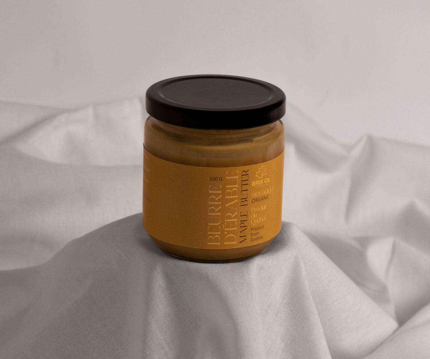
The maple syrup’s packaging design for Brix Co. showcases chic and contemporary elements. The sleek, modern aesthetics sets it apart from typical market clichés, capturing attention with its unique approach. Typography plays a vital role in evoking the customs of maple production, conveying a sense of tradition and authenticity. The carefully chosen color palette further enhances the packaging’s appeal, exuding a warm and inviting aura that aligns perfectly with the essence of maple syrup.

Series of chic maple product packaging for Brix.co. The packaging breaks away from existing market clichés, while evoking the customs of maple production through typography and color.
Get unlimited access to latest industry news, 27,000+ articles and case studies.
Have an account? Sign in


