THIS IS IT! DIELINE Awards 2026 Late Entry Deadline Ends Feb 28
L’Artigiano is a chain of Italian food delivery restaurants known for their traditional recipes, quality ingredients and freshly prepared meals. As the well know brand evolved over the years, the company turned towards a more sophisticated take on Italian food and with that decision the design firm 2 Yolk came in to help communicate this new message.
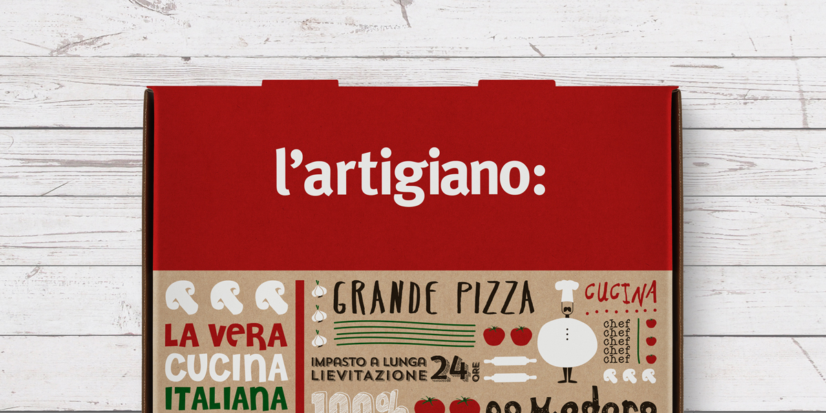
“The logotype was redesigned using simple typography paired with a colon (:) punctuation mark thus conveying that “L’Artigiano is…” all about the finest, freshest ingredients, an abundance of Italian flavor and taste.”
2 Yolk knocked this design out of the ballpark! The new takeaway packaging is a collage of hand lettering, custom illustrations and high contrast colors. The sketch-like illustrations are culinary inspired, showing the tools and ingredients used to make each meal with little nods to famous elements of Italian culture tucked in. And, as I’m a sucker for cute and silly things, I love how the human characters are dressed up in bell pepper and tomato “suits!”
Get unlimited access to latest industry news, 27,000+ articles and case studies.
Have an account? Sign in


