THIS IS IT! DIELINE Awards 2026 Late Entry Deadline Ends Feb 28
Kulturhaus’s Craft Beer Puts Modern Art on Tap
By
Published
Filed under

By
Published
Filed under

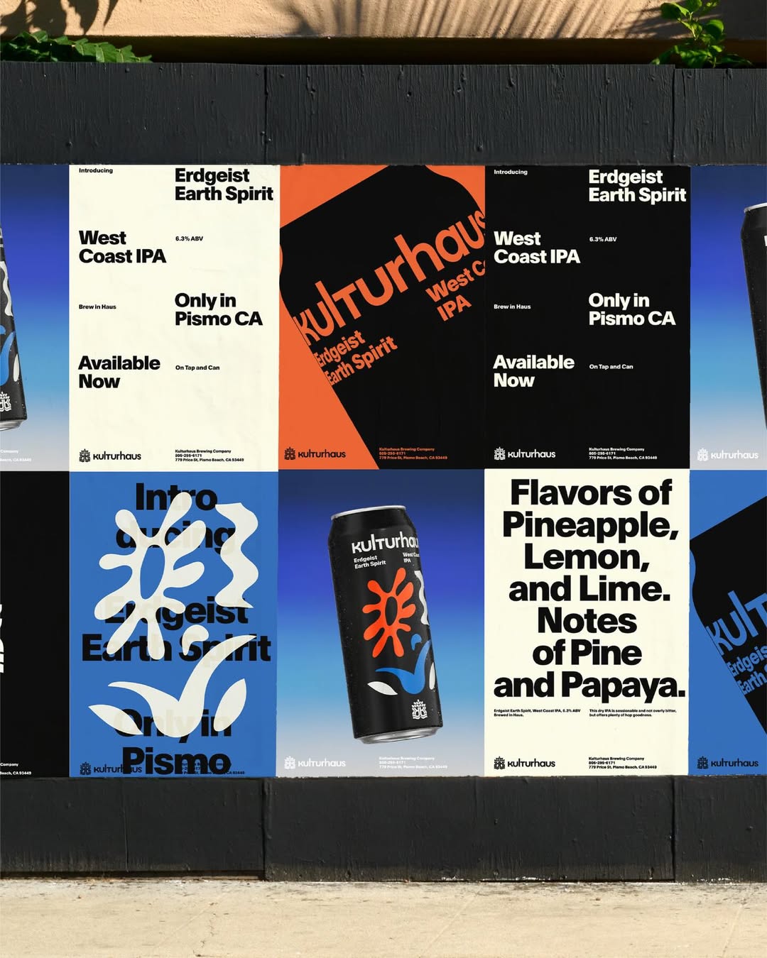
This is a craft beer can that looks like it embraces art and design more than the typical brand.
Kulturhaus’s packaging, designed by Play, trades the usual hop-heavy chaos for minimalism. The typography is clean and utilitarian, while the matte black base makes the red, blue, and white shapes pop with crisp contrast. The abstract symbols look like folk motifs without becoming literal or overdone storytelling. The craft beer space is typically addicted to cartoons and clutter, but this one is sharp and minimal.
Get unlimited access to latest industry news, 27,000+ articles and case studies.
Have an account? Sign in