JusRol Rebrand Serves Up Packaging That Really Takes the Cake
By
Published
Filed under

By
Published
Filed under

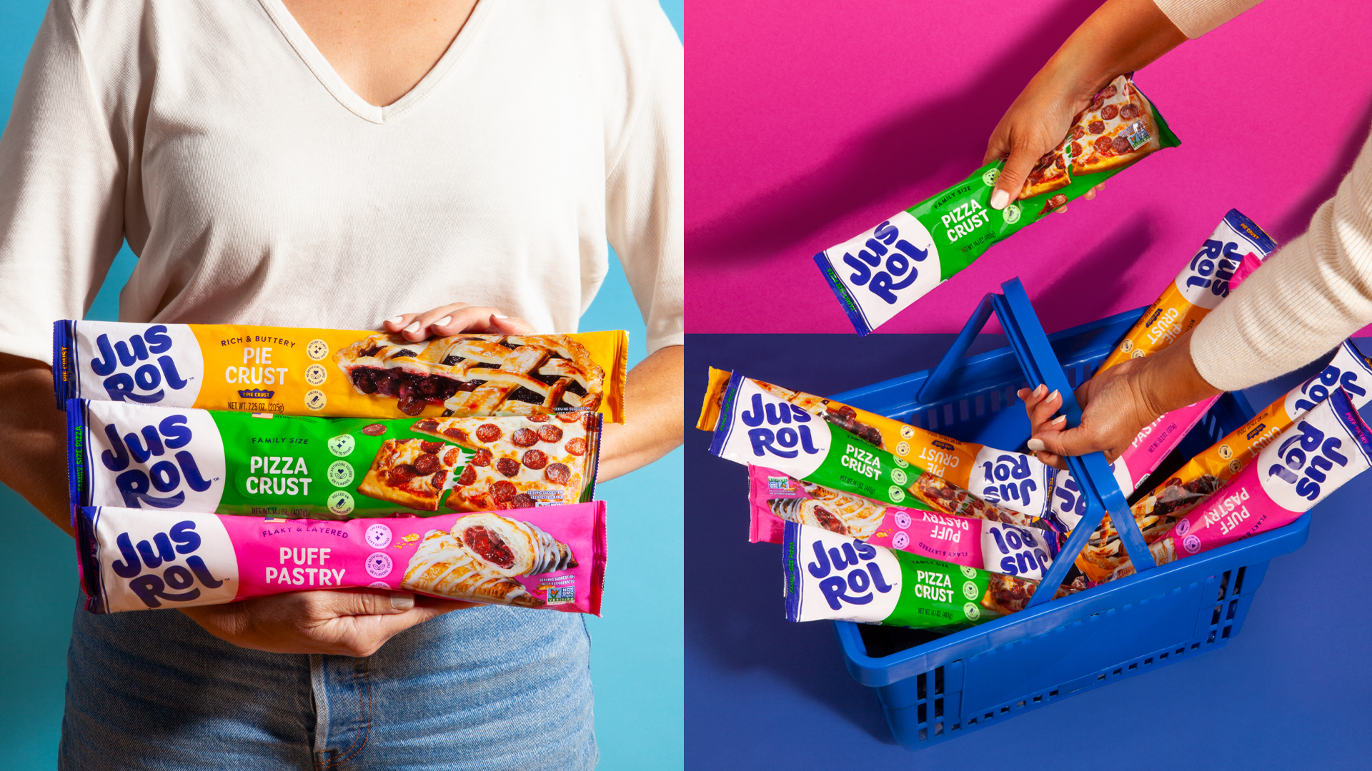
JusRol’s rebrand is all about high-impact clarity. Olio Studio focuses on a chunky, almost hand-painted logotype that nods to 70s food packaging and weekend baking ads without overdoing it on the nostalgia.
Each SKU is paired to a specific color, hot pink for puff pastry, traffic-cone yellow for pie crust, and bright green for pizza dough, so shoppers can spot what they need in seconds. Paired with oversized product photography and engaging cropping, this clearly isn’t Pilsbury.
Get unlimited access to latest industry news, 27,000+ articles and case studies.
Have an account? Sign in