THIS IS IT! DIELINE Awards 2026 Late Entry Deadline Ends Feb 28


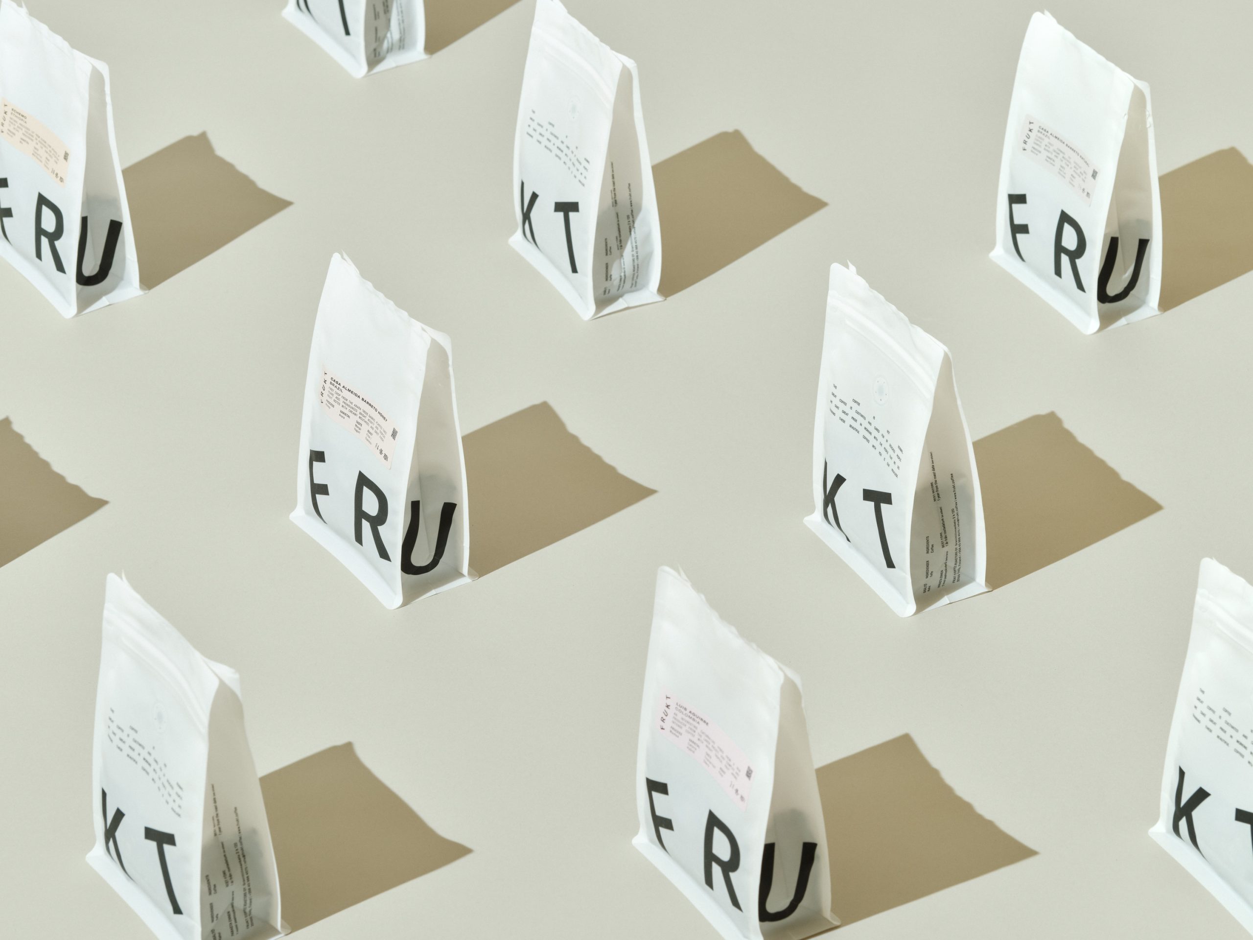
FRUKT Coffee Roasters’ minimalist packaging, designed by Tomi Leppänen, embraces the age-old graphic design cliché “make the logo bigger” and manages to create a striking visual impact. This approach allows for various playful word and letter combinations, filling retail shelves with dynamic designs.

Bold black typography on a white background ensures the brand’s name stands out, while the use of white paper cups and matte pouches emphasizes quality and sustainability. The resealable pouches also ensure the coffee’s freshness.
Get unlimited access to latest industry news, 27,000+ articles and case studies.
Have an account? Sign in