THIS IS IT! DIELINE Awards 2026 Late Entry Deadline Ends Feb 28
The past twelve months have been a bumper crop year for brand redesigns. Facebook’s rebrand into Meta attracted much attention and discussion; most of it centered on its strategic realignment, less so about the droopy-Mobius-strip logo.
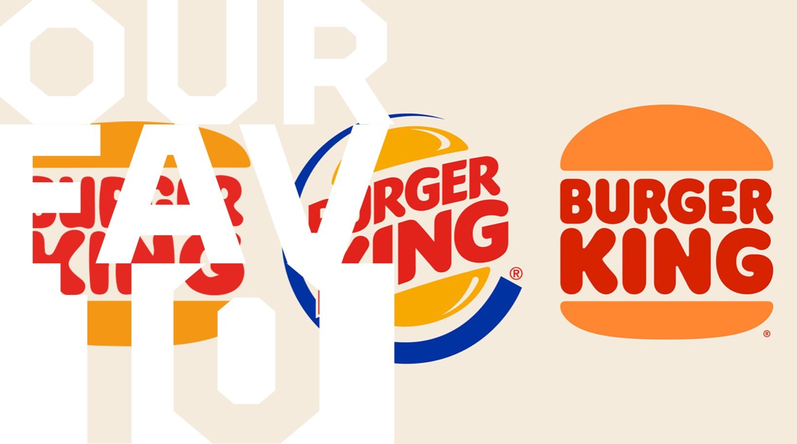
The top ten refreshes of the year weren’t so dramatic, but in some cases, were replacing decades-long branding, often opting for a flat design. While it might be easy to dismiss flanding—or flat branding—as a tired fad, some of the best refreshes of the year demonstrate that flat design still hasn’t reached its bottom.
One thing 2021’s top ten brand refreshes have in common is boldness. There are no pastels to be found in this bunch. Brands used striking color palettes, typography, and graphics to mark their respective categories with their brand freshes. Of course, packaging for all the top ten brand refreshes is exceptional. In some cases, the change is a significant move away from a signature and long-standing identity that maintains and communicates the brand’s values and character.
Get unlimited access to latest industry news, 27,000+ articles and case studies.
Have an account? Sign in


