Brasserie Diagonale Has Tapped A Sleek Beer Design
By
Published
Filed under

By
Published
Filed under
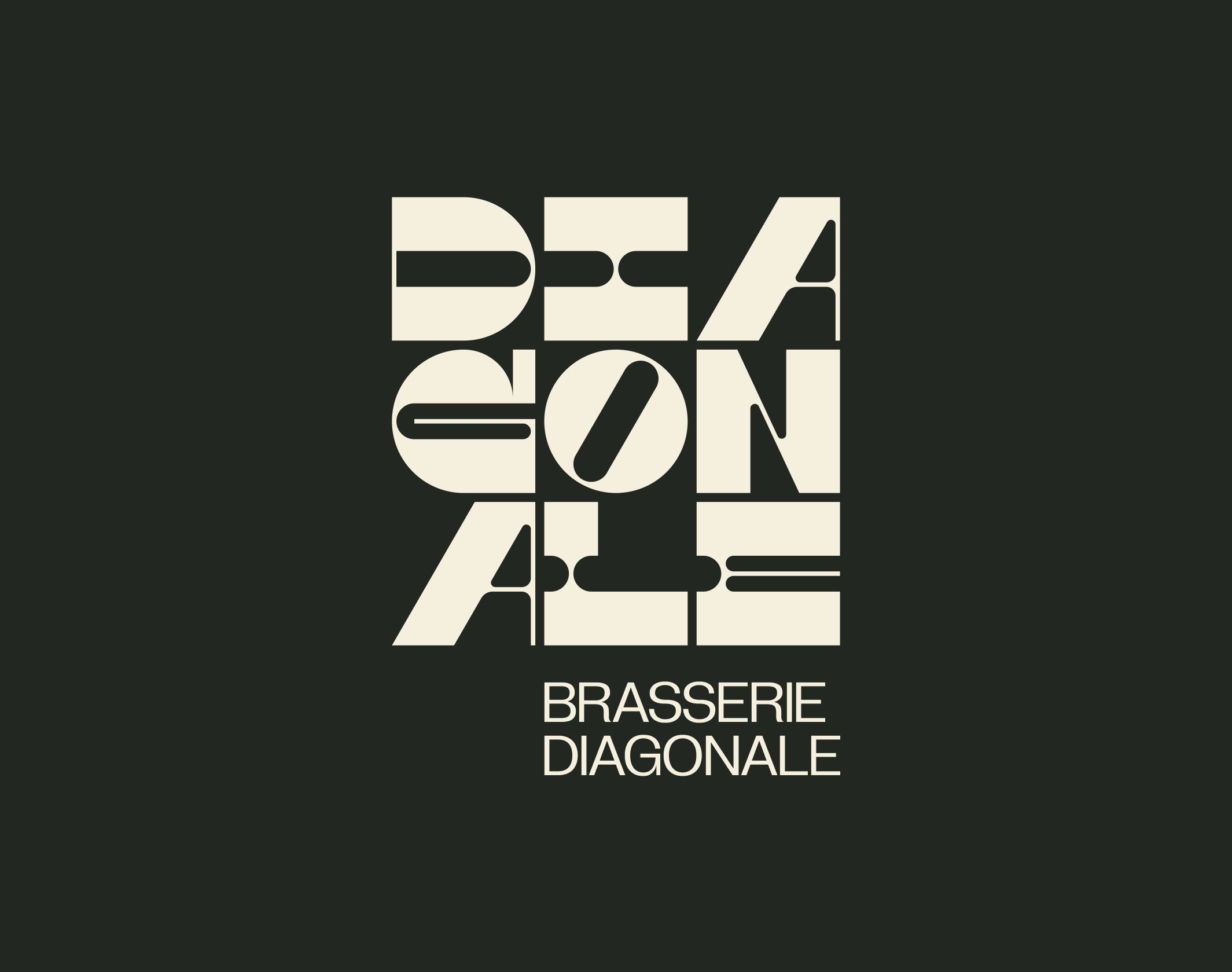
Diagonale Brewery, designed by Brand Brothers, has packaging that will spark inspiration. The logo itself is geometrical, linear, and funky, all while packed into a tight and perfectly kerned square; it seems like kismet that the brand’s name happened to have nine letters. Each beer can is labeled depending on the type of beer, and the color choices are incomparable: think bright poppy, neon pink, and butter yellow. The cans remind me of Bauhaus design, but with an unexpected and modern twist. Perfection.
The Diagonale Brewery was born from the imagination of Thierry and Benoit, long-time friends whose respective careers have taken them all over the world. Back in the East of France, the idea of creating an independent micro-brewery in Broussy-le-Grand (Marne) was born in 2019, with the objective of sharing the singular life trajectories of the two founders in craft beers. At the end of 2020, Brand Brothers was commissioned to design the complete visual identity of the project.
Get unlimited access to latest industry news, 27,000+ articles and case studies.
Have an account? Sign in


