THIS IS IT! DIELINE Awards 2026 Late Entry Deadline Ends Feb 28
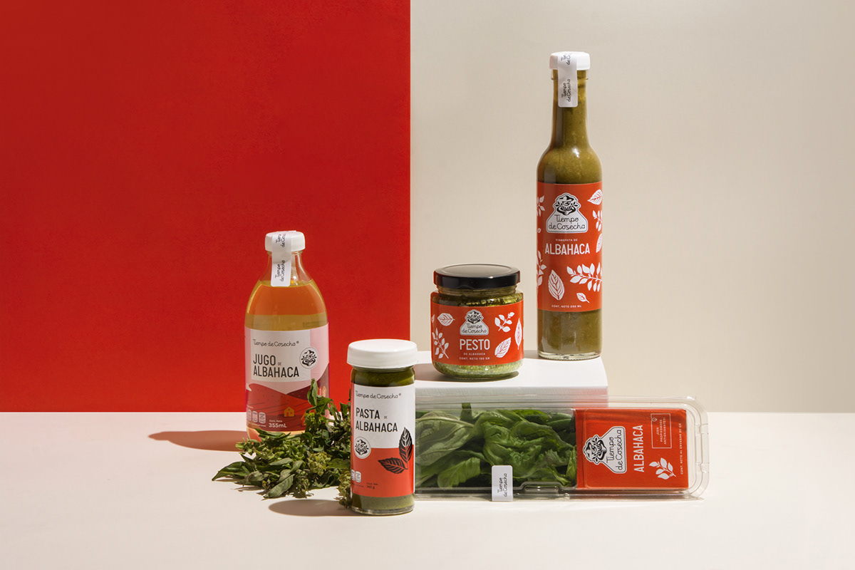
We’re very into the design for Tiempo de Cosecha’s line of fresh herbs and sauces, that utilizes gorgeous hand-drawn illustrations of herbs and flowers that correspond to what is contained in each package. The clean, minimalist designs utilize landscapes, bright colors, and san-serif fonts to create a brand system that is clean, health-inspiring, and trust-worthy.
Tiempo de Cosecha is a Mexican brand specialized in selling fresh herbs and derived products. They approached us because they were facing a problem with their prior branding: people would not remember the brand even though they had already consumed it.
We wanted to resemble nature, outdoors, landscapes and country-life, so we created a memorable icon of a farmer picking up crops. For the word mark we made a script typeface that is both friendly and accesible.
Get unlimited access to latest industry news, 27,000+ articles and case studies.
Have an account? Sign in