The Office Of Ordinary Things Elevates Simply Organic’s Single-Origin Spice Line With Vintage Apothecary-Inspired Packaging
By
Published
Filed under
By
Published
Filed under
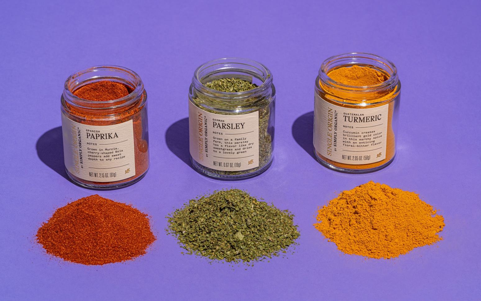
Simply Organic, an all-organic spice company, sought to give its new product family of premiere single-origin spices a sense of exclusivity. The Office Of Ordinary Things took on the challenge and designed a packaging system that emphasizes each ingredient’s uniqueness, origin, quality, and potency. Drawing inspiration from vintage apothecary labels, the design sets the products apart on the shelf and establishes their high caliber. The main brand of Simply Organic gracefully steps back, allowing the spotlight to fall on each spice’s distinct qualities, including its geographic origin, cultivation methods, and potent flavor characteristics. The design system was thoughtfully applied across a wide range of SKUs, diverse packaging touchpoints, and captivating promotional videos, demonstrating the cohesiveness and effectiveness of the overall branding approach.
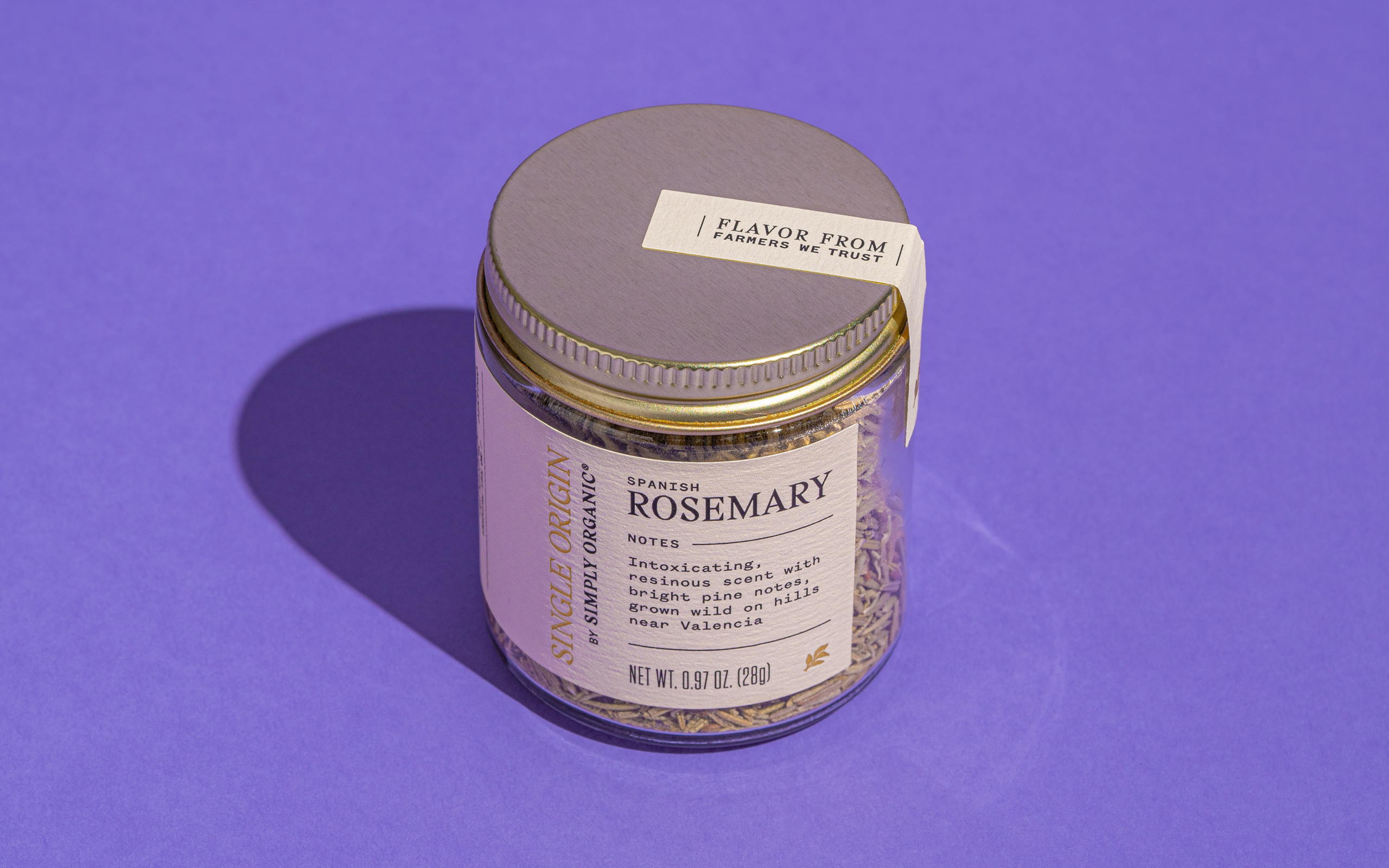
Simply Organic, the O.G. all-organic spice company and worker-owned co-op, wanted to elevate the cachet of their new product family: a line of premiere single-origin spices. We designed product packaging that helps emphasize the ingredients’ uniqueness, origin, quality, and potency.
Get unlimited access to latest industry news, 27,000+ articles and case studies.
Have an account? Sign in


