After Almost Three Decades, Pure Protein Undergoes A Packaging Update
By
Published
Filed under
By
Published
Filed under
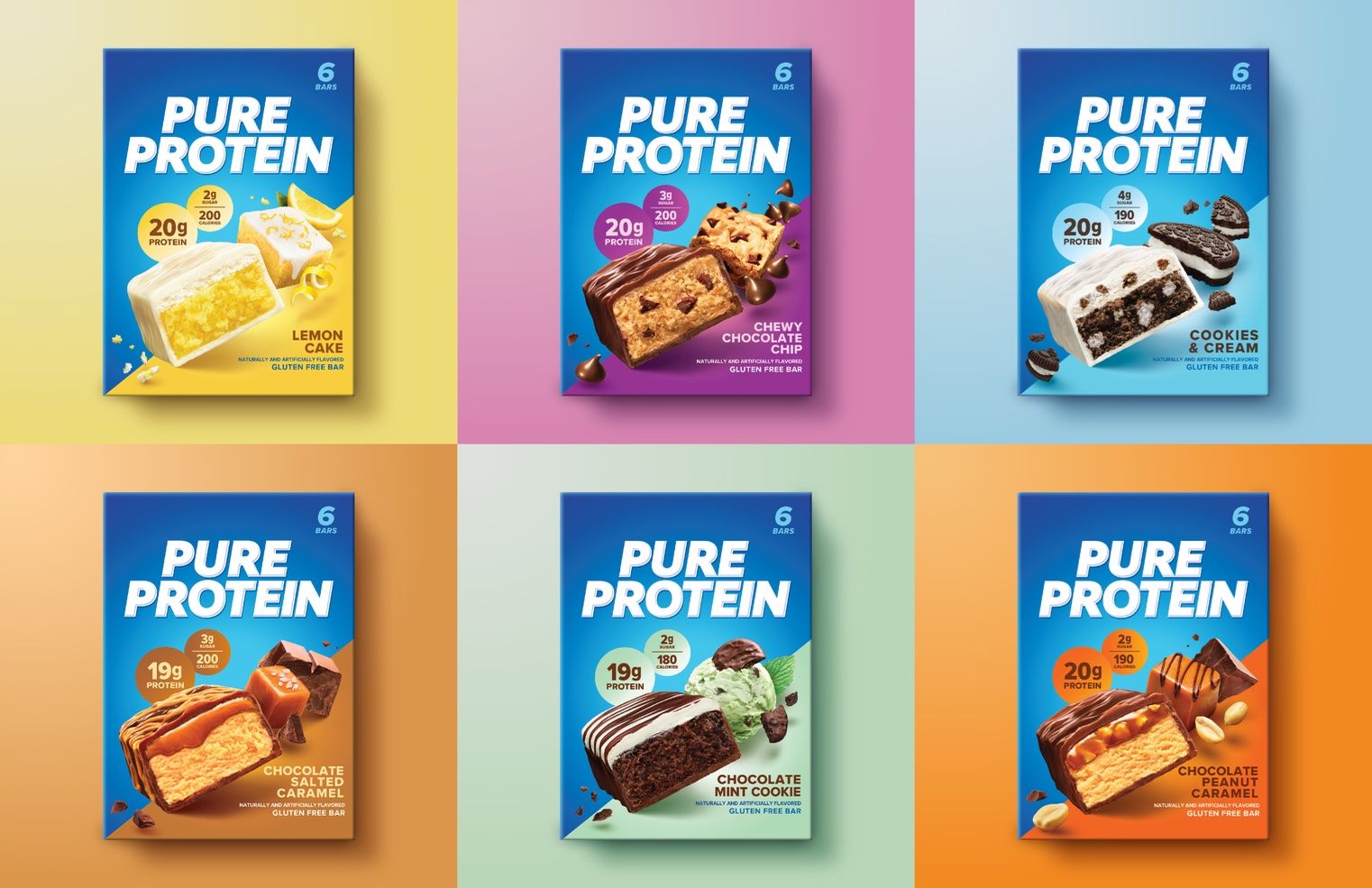
It’s one thing to redesign an entire range of products within a brand, but it’s another thing to undergo a redesign overhaul after nearly three decades of remaining the same.
Established in 1995, Pure Protein, a nutritious on-the-go snack brand, has just announced its new, evolved packaging system designed by Beardwood&Co. The contemporized design includes a revamped logo, a revived color palette, and an updated typeface.
“Pure Protein came to us with the challenge of redesigning the Pure Protein brand to emotionally connect with and attract a broader base of users while reinforcing loyalty among existing customers,” shares Julia Beardwood, founder and CEO of Beardwood&Co. “The redesign had to reflect and exemplify its brand positioning to go beyond the gym as a great-tasting, fast-growing lifestyle brand.”
Get unlimited access to latest industry news, 27,000+ articles and case studies.
Have an account? Sign in