Featured image for Amour Liquide's Small Cans Are Mighty In Aesthetics

Amour Liquide's Small Cans Are Mighty In Aesthetics

by Chloe Gordon on 03/29/2023 | 2 Minute Read

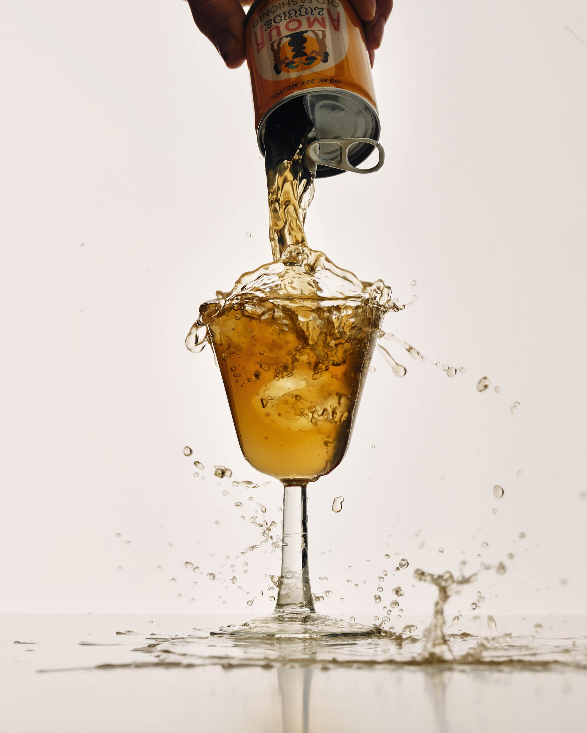
With graphic design from Caserne and brand identity from Land, Amour Liquide's packaging system highlights a charming and high-end aesthetic that's still accessible. Inspired by mythology and vintage aesthetics, the short cans are small but admiringly big in attitude. Plus, the combination of the range of typographic styles creates an engrossing system that emphasizes attention to detail.


amour_02.jpg

Amour Liquide’s mission is as simple as it gets: to encapsulate “bar-quality” cocktails in a both charming and convenient package. This pocket buddy can follow along when you go on your adventures, be it a casual apero, an afternoon at the park or a relaxing sailboat ride. Liquid, effortless mixologic refinement has never been so accessible – and delicious.

amour_03.jpg

The visual identity is a mix of different eras. The illustration is inspired by mythology and recalls old drawings. The color palette is a tribute to the 70s and to this generation of "peace and love" echoing the name of the product.

amour_04.jpg
amour_05.jpg
amour_06.jpg
AMOUR_idea10.jpg
CHASSE-MARIE_AMOUR0019 1.jpg
CHASSE-MARIE_AMOUR42680.jpg