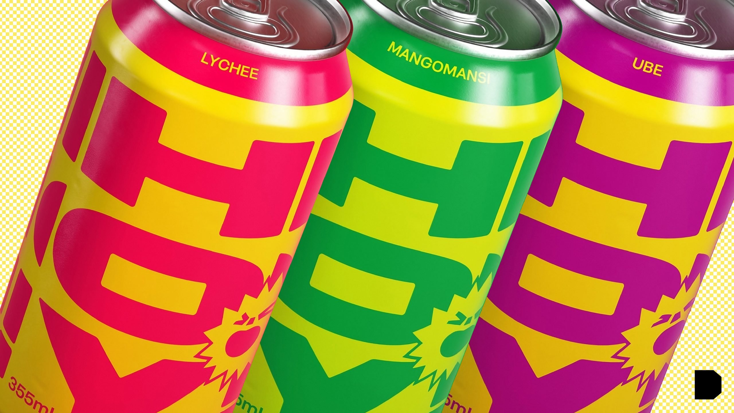
Theresa Zettner designed the conceptual brand Hopscotch with the trendy millennial demographic in mind. The retro-inspired typography and modern color palette melt into one another to create a wonderfully nostalgic design with a modernized twist. And, if that weren’t enough, the short cans add a delightful mini dimension to an otherwise monotonous RTD market.
Hopscotch is a canned cocktail brand targeting a hip millennial audience. With a focus on marrying a retro inspiration with the modern trend of ready-to-drink cocktails, the brand aims to harness the nostalgia and cultural equity of vintage Americana while injecting fun and energy into the brand. Drawing inspiration from various vintage can labels and trucks, I emulated a classic look and feel via the type modification and layout of the crest. In order to bring the brand into the present, I chose a bold and bright color palette not only to make the packaging more engaging, but to differentiate from competitors. Additionally, I chose the typeface Roc Grotesk because it allows for a more robust emphasis on the future-forward brand in its broader applications, while still fitting within the overall vintage aesthetic of the label.