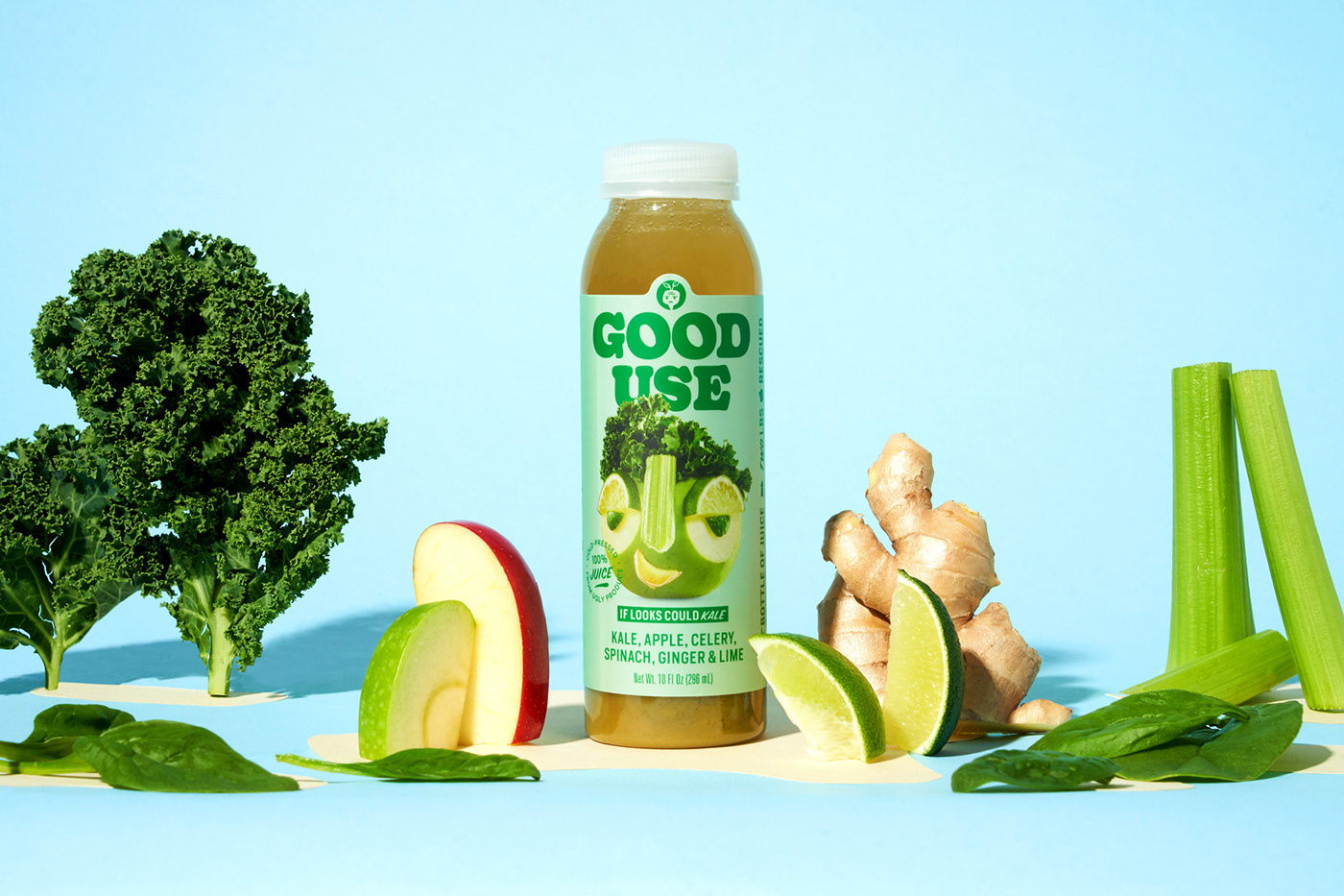
Hatch Design worked with Good Use, a brand known for taking “ugly” fruits and vegetables and turning them into juices, to redesign their packaging. The packaging design leans into the personification of fruit in a beautifully animated way. But beyond the fruit-driven illustrations, the bold typography and vivid color palettes create a packaging system that effortlessly stands out.

Good Use came to Hatch to make their ugly produce-fuelled juice the belle of the fruit bowl. We built our cast of curious characters to celebrate their seasonal flavor varietals (without leaning into specific ingredients) and partnered with a phenomenal photographer (Annabelle Breaky) to bring them to life.


