Featured image for 11 Design Standouts from Sweets & Snacks 2022

11 Design Standouts from Sweets & Snacks 2022

by Fred Hart on 06/02/2022 | 4 Minute Read

You just know it’s going to be a good trade show when it’s called Sweets&Snacks

The annual Expo returned to Chicago for the first time in three years and had plenty of sweet surprises in the branding and design department. Billed as an essential pitstop for the snacking set, thousands of confectionery and snack brands and retailers come peddling their wares with many a free sample. You'll find plenty of start-ups and snacking product innovations at a dizzying rate, and did we mention the samples? There are lots of samples.

Amongst all the nut-butter-filled chocolates, indulgent cookies, new wave gummies, and innovative salmon-skin snacks (you read that right), we’ve highlighted 11 standout brands.
Editorial photograph

Rallies

A new brand launch from the chocolate wonders of Nestle, the Rallies brand is all about fun, indulgence, and a dose of pick-me-up attitude. The high contrast duotone colors bring a friendly exuberance that acts as a beautiful backdrop for mouth-watering food photography. The copy’s equally delightful with phrases like “the sweet taste of a little self-care” and “it’s a pep talk that fits in your pocket.”

Editorial photograph

MF’n Kookies

Now, these are cookies with attitude! A fun name gets paired with an equally cheeky illustration of the founder with crazy cookie glasses—what’s not to love? The graphic illustration style is beautifully juxtaposed with decadent photography atop the box and makes for a decent replacement if you can't score the latest Last Crumble drop.

Editorial photograph

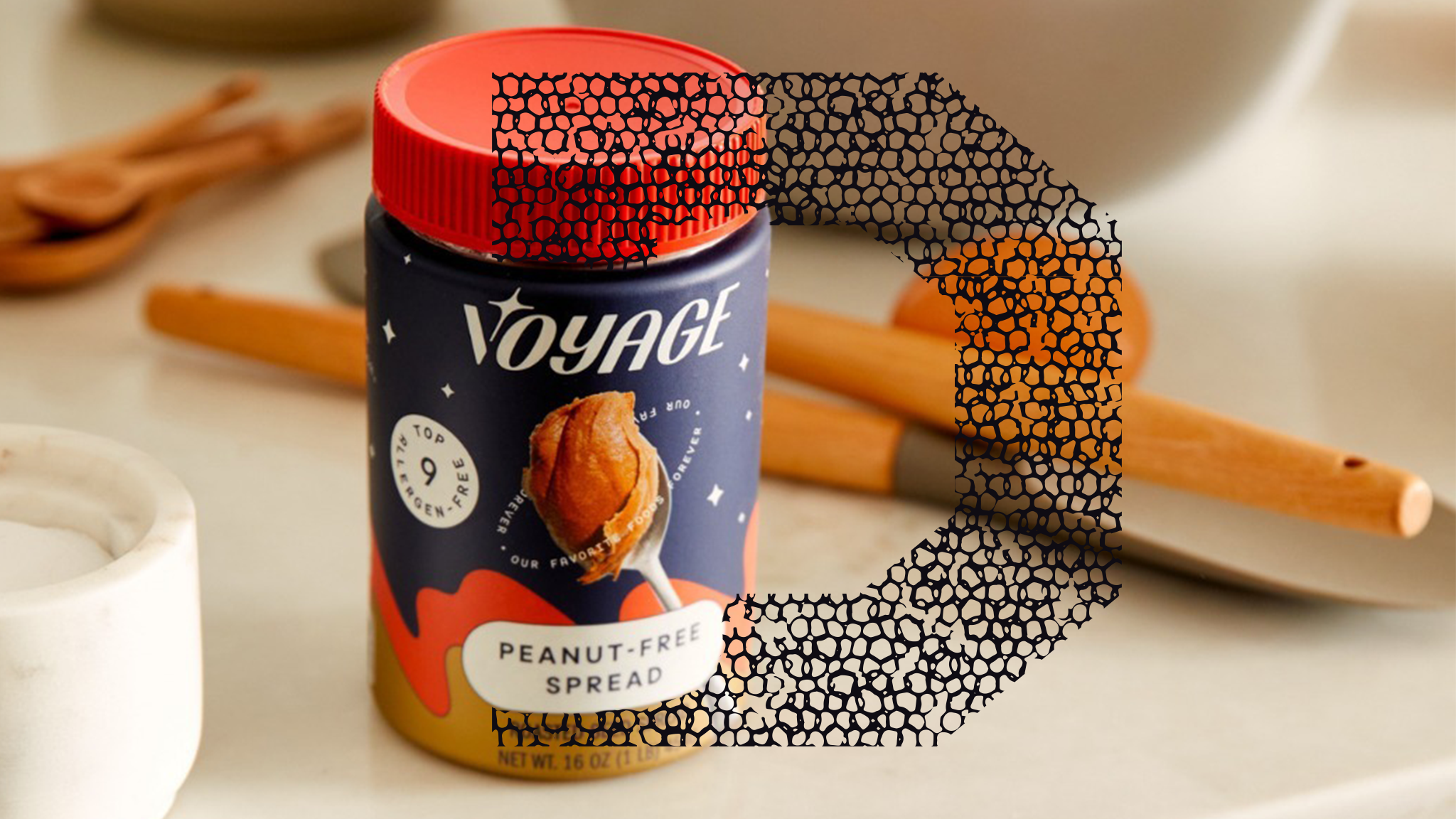
Voyage

Welcome to the future of food, where all of your favorites are free from their problems. Take this peanut-free spread; it tastes just like peanut butter but without peanuts, something akin to pure voodoo. The brand is shooting for the stars, exemplified by its logo mark, space-themed background, and claims orbiting around the spoon, all of which make for an out-of-this-world brand. 

Editorial photograph

A’capella

Here’s a chocolate brand that hits all the right flavor notes. A’capella's beautifully crafted wordmark arches over the center of the food photography, bordered by floating ingredients and inclusions, creating a harmonious symphony of delicious design elements.

Editorial photograph

Meli’s

The retro diner of your dreams just came to life in your new favorite cookie brand. Meli’s employs a characterful and casual script wordmark alongside a soft, pastel-like color palette mixed with a wavy pattern to create a cool throwback look that screams from scratch-deliciousness. Better still? You wouldn't know it was gluten-free if it didn't say so on the packaging.

Editorial photograph

Octonuts

Every bag of Octonuts is a beautiful, bold fire engine red mimicking the equally bold flavor and crunch of their roasted almonds. The close-up photography stops you in your tracks, and the octopus logo bleeds off the right side to create an abstract pattern that wonderfully juxtaposes with the graphic imagery.

Editorial photograph

Maddy & Maize Fancy Popcorn

It’s all about the finer things in life, like chocolate-drizzled popcorn that makes you feel as special as it tastes. The design is no different, using a category-breaking illustration style that forgoes typical food photography for something more fun, elevated, and playfully whimsical. The color palettes are decadent, and the typography is simply splendid. 

Editorial photograph

Irvin’s Spiced Salty Eggs

“What’s a flavor bomb look like?” must’ve been the brief for Irvin’s. This boldly flavored salmon skin and potao chick snack brand opts for equally bold design elements, between its bomb-inspired logo, graphic background patterns, and exploded holding shape behind the product photography. What you see is what you taste!

Editorial photograph

Without A Trace

This allergen-friendly brand of granola bars, crisps, and cookies, free of the top nine allergens, eschews complicated bells and whistles for a stripped-back look and feel that says there’s nothing to worry about here. The logo anchors the design system with soft sans-serif typography and a pleasantly speckled background pattern.

Editorial photograph

Joyride

Low sugar does not mean low energy, and Joyride knows this best. This gummy brand is all in on high contrast patterns that tell consumers this will be a full flavor adventure for your mouth hole.

Editorial photograph

Healthy Hippo

Despite being healthy, this Hippo still knows how to have fun. The clean, minimalistic packaging for this brand of plant-based, low-sugar gummies gets anchored by a flat, funky line illustration logo paired with chunky, 70s-inspired sans-serif typography. Yes, give us all of the Swedish Hippos.


Voyage photography by Kirk Robert.