Featured image for ITCHY Is All About Human Centric Pharma

ITCHY Is All About Human Centric Pharma

by Chloe Gordon on 04/29/2022 | 3 Minute Read

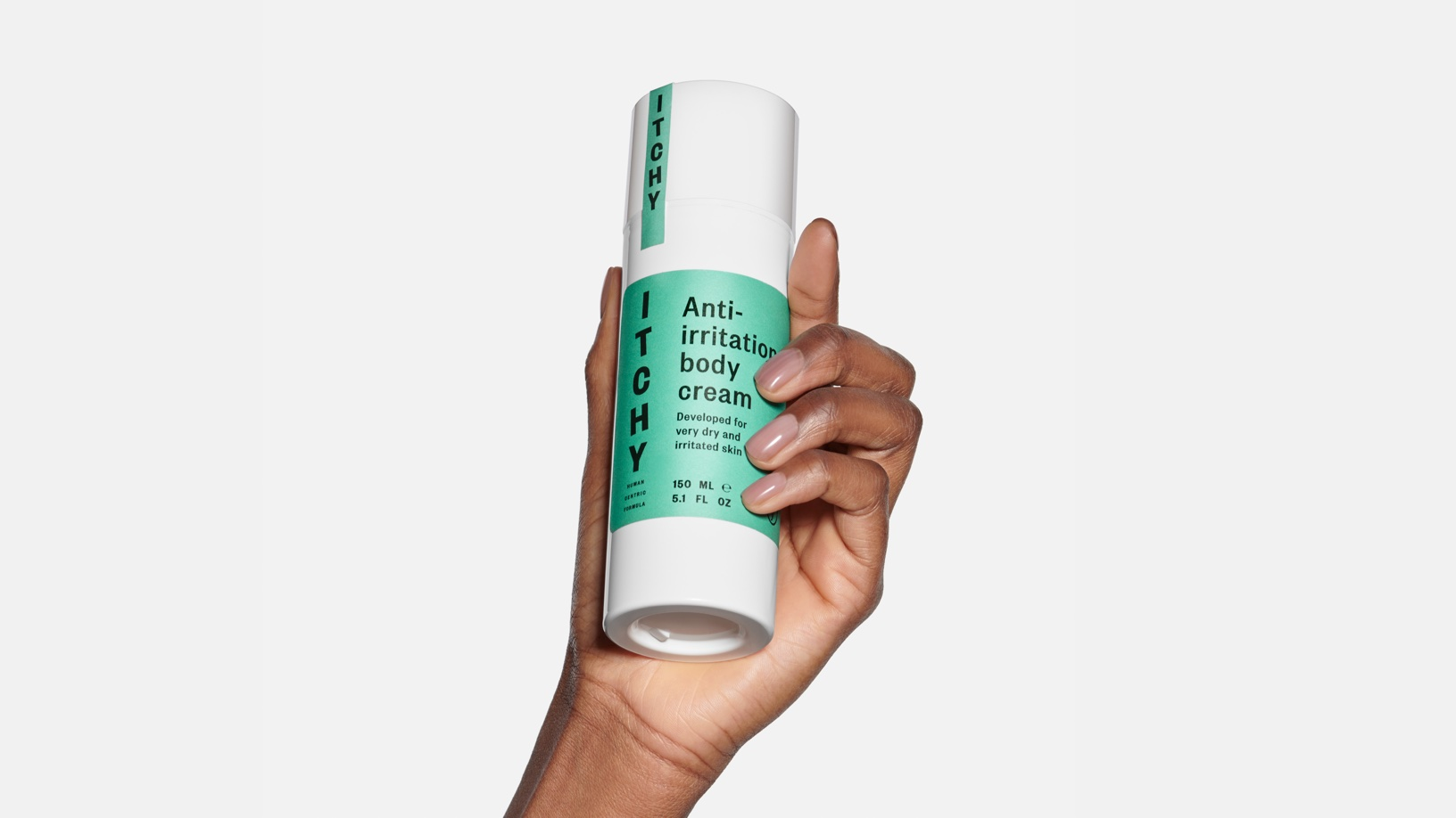
Itchy skin is one of the worst sensations, but if anything can help, it's a human-centric product that genuinely cares about the consumer. ITCHY is a brand designed by a founder that knows the struggles of itchy skin through first-hand experiences. Leaning into the prickly feelings, the logo emulates an almost tingly sensation. Further, the color palette doesn't shy away from being bold, proving that medicine doesn't always have to feel clinical and dull.


Editorial photograph

When the founder of ITCHY was diagnosed with psoriasis in the early 80’s, he entered a problem focused and uninspiring world. In addition to hiding visible spots in long sleeves and suffering from a daily itching, he got constantly reminded of his “problem skin” by the products he was prescribed. 

All grown up he wanted to change this with a new take on pharma – and ITCHY was born. With an online store and a community up and running, he felt that the identity didn’t live up to what he wanted for the brand. So together we re-invented the expression. Or even better, we re-invented history! 

Editorial photograph

We went all the way back to where it all started for the ITCHY founder; to the 80’s pharma products. We wanted to make it right this time. By turning what had felt problematizing back then to a positive and friendly remedy – we were set to create a welcoming and proud world. 

We defined it as to make “Human Centric Products” – and to bring in the human perspective throughout the customer journey. It was important to keep building on the brand community for people diagnosed with “problem skin” – and to make them feel “skin proud” instead. It led us to tailor the whole identity around not hiding problems – but rather showing them with pride and personality. 

Editorial photograph

We made the logo itchy. Scratching and moving. Adding a bit of humour to the serious problems of skin itch, atopic dermatitis and psoriasis. For the signifier, we were influenced by the 80’s pharma brand logos and their oval shapes. The oval was also made into a versatile graphic element – a perfect mirror shape, or frame, to use for images in communication. For typo, we chose a classic pharma font with a twist; Founders Grotesque. And everything from the unboxing experience to the greetings card was topped off with retro medicine influences. 

The ITCHY community is now giving self-confidence – encouraging to stop hiding beautiful skin and to always be skin proud. All in all it’s a modern and human friendly design, proving that problem solving doesn’t have to feel clinical and sterile. With ITCHY you’ll get human centric pharma cosmetics for a lifetime. 

Editorial photograph