DIELINE Awards 2024 – EARLY BIRD ENDS THURSDAY
Featured image for Brendel Is A Good Wine With Great Packaging

Brendel Is A Good Wine With Great Packaging

by Chloe Gordon on 02/17/2022 | 3 Minute Read

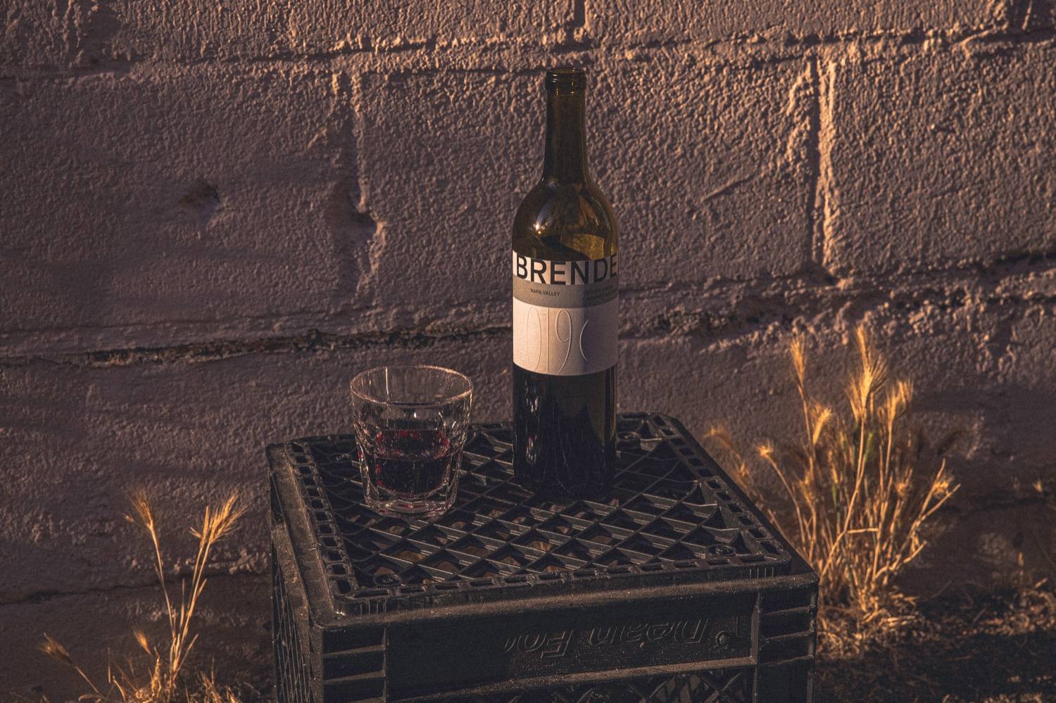
Brendel is all about creating good wine accessible to all, and part of that accessibility is showcased through the packaging. The simplicity of the design showcases the simplicity of the wine and the playful nature of the brand. The color palette of the label is inspired by the land of the vineyard, and the white space allows the label to feel simultaneously grounded and elevated.


Editorial photograph

Challenge: Introduce a new selection of varietal wines from Lawrence Wine Estates that sets it apart in the Napa Valley world of fine wines by making it accessible to everyone. To communicate a more casual tone for the brand in a category that screams elitism, Butchershop created a brand platform “Purveyors of Pure.” The idea captures the simplicity of the organic wine, and its roots in the soil of Napa’s farmland tradition, while also emphasizing the brand’s devotion to wine-making and delivering a quality product. Brand Strategy: Butchershop came up with the name for the new brand: Brendel, named for the founder Leon Brendel, who bought a small plot of land to make wine his way. They broke off from fine wine – to showcase Brendel as good wine. “Because while fine wine brings some people together, good wine brings everyone together.”

Editorial photograph

Design core: They brought forth a playful tone that is seen in its illustration and positioning and is carried through in copy. The look and feel of the labeling, logo and type is classical – but approachable. Logo/Type: Butchershop went through a robust process to create the logo and wordmark, that incorporates a bold, and functional secondary wordmark in a san serif. The secondary wordmark includes the year and location, fixtures of wine culture. The primary wordmark and logo offer a contrast, introducing an elegant serif that when paired with the secondary logo, create a layered effect that is at once relatable and refined. Color: The color palette was inspired by the colors of the valley, while remaining expansive enough to encapsulate a variety of wines and potential future product evolutions. Butchershop focused on a metallic grey, orange-red, dust green and golden hour.

Editorial photograph

Illustration: The Design uses hand-drawn illustrations of Leon and his dog that spark a feeling of delight and discovery. The illustrations are interspersed throughout the Brendel web site. The illustrations show Leon tending to the land by picking grapes or rolling a wheelbarrow along the property. The illustrations add a vintage touch to a modern brand, signaling an aspirational elegance. Website: Butchershop shot a variety of photo and video assets to be used in multiple formats. The video provides movement to the Brendel website and provides added content that will be used across social channels. In addition, the website navigation includes a variety of badges and marquees to layer motion, emulating the pace of Napa Valley, a place that can move quickly and slowly at the same time. Technology: The Brendel Wines site was built in Wordpress. Commerce7 was used as the e-commerce api platform to integrate wine sales. PHP, Javascript, Jquery, CSS3, and HTML5 were also used in various capacities to create a dynamic experience. Website: https://brendelwines.com/

Editorial photograph