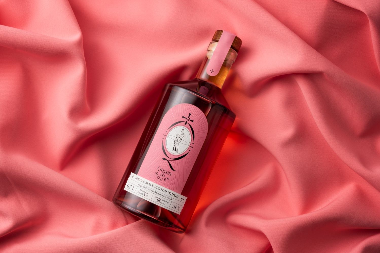
Great&Golden designed the whisky packaging for King&Mouse, a popular whisky bar in Lithuania, as an intentional statement piece, one that, when seen, would immediately represent the Lithuanian bar’s popularity and branding. The design agency thoughtfully chose the pink coloring to represent that whisky is for all, regardless of gender, and showcase the drink’s more delicate side. Additionally, the box the bottle comes tucked inside is dark, creating a more premium aesthetic and a solid touch.

The task King&Mouse is one of the most popular whisky bars in Lithuania, not only selling whisky, but also creating their own blends. This year they launched Madeira cask-finished whisky which is called pink by whisky professionals. It has a smooth taste and was made of ingredients found in Madeira island of Portugal.


