The Royal Redesign: Behind the New Look and Feel for Burger King
by Theresa Christine Johnson on 02/22/2021 | 4 Minute Read
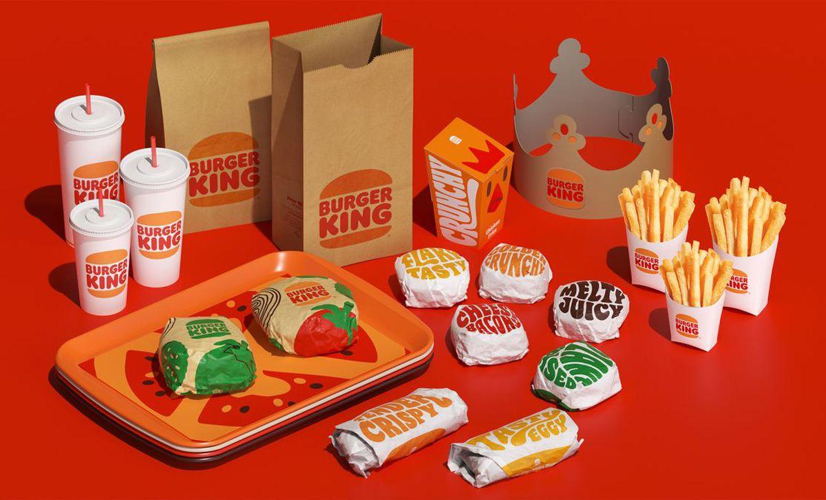
At the beginning of 2021, Burger King unveiled a new look that’s more mouthwatering than ever—you can almost feel the savory fries on your tongue and taste the flame-grilled goodness of their hamburgers. Designed by Jones Knowles Ritchie (JKR) under Restaurant Brands International (RBI) leadership, it's safe to say they gifted us a redesign well-suited for royalty.
What prompted the first redesign for the King in over two decades? For one, they wanted to look even better on-screen—it’s a key touchpoint where many consumers interact with the brands they love. Beyond that, they also wanted to spotlight the thing that makes the fast-food chain unique—the ingredients.
“It was a lot of investment in a digital transformation and how to make going to the restaurant or on an app the most interesting and pleasant,” said Rapha Abreu, vice president and global head of design at RBI. “But we are also almost reinventing the brand from a food quality perspective. We’re removing all artificial flavors and colors, and we’re clearing the menu from high-fructose corn syrup. Plus, we have more of a commitment to sustainability, people and communities, and the planet.”
With all of that in mind, Rapha didn’t feel that the visual identity they’d had since 1999 reflected the Burger King of today. The previous logo was an element he felt had a lot of room for change. It included a blue swoop that felt almost futuristic—definitely not something that conveyed natural ingredients. “Brand identity should be like putting a mirror up in front of the brand,” Rapha added. “You see an image reflected there, but we didn't see the right image reflected.”
The new logo was a big part of the redesign, and Burger King’s new one looks stripped back but more suited for a food brand. “It’s the badge of a brand,” Rapha said.
There’s something wholesome about it, and the simplicity of it reflects the trustworthiness of the ingredients. The warm color palette found inspiration in the food and preparation of items on the menu. The yellow is that of melted cheese, the brown resembles the perfectly flame-grilled patties, and green is like what you’d see on a crunchy piece of lettuce. Even the typeface is juicy, rounded, and appetizing.
“We talk about food quality through taste,” Rapha added. “It was really about making a tasty identity.”
At first glance, the new look for Burger King seems familiar. They definitely pulled inspiration from the 1969-1998 design, but Rapha insists they weren’t going for retro. We’ve seen a lot of brands rely on the nostalgia and comfort of the past (especially during the pandemic), but this redesign was in the making long before COVID-19.
“We didn’t aim for a vintage aesthetic,” Rapha explained. “We explored many different routes, from crowns to symbols to many other elements. But we felt like during that time we looked our best. The logo communicates confidence and doesn’t try too hard, and it’s a long-lasting design.”
They explored other options, but always found themselves going back to the ‘69-’98 design—something about it just fit. Take the logo, for instance. The top and bottom bun can barely contain the thick burger patties of the brand name. It’s easy and uncomplicated but can communicate so much. As JKR and RBI worked through the redesign, Rapha mentioned their work was just as much about creating something special as it was about picking and choosing the elements that needed eliminating.
He went on to say that a clean design (to represent clean ingredients) was critical, but they couldn’t fall into the trap of a super minimalist look. Burger King is bold, fun, and brings a lot of personality to the table, so the criteria were still about standing out. So while the redesign pared elements down, they ensured every design asset came infused with personality.
“We want to make sure what we’re creating is category-defining, but being timeless was just as important,” Rapha added. “So there are fewer elements, but they work really hard for us.”
Redesigning a fast-food chain with 18,000 locations worldwide wasn’t something RBI took lightly. Did they really want to come out with a new logo, only to have the old one immediately look outdated? After all, switching out uniforms and packaging can happen relatively quickly—but renovating brick-and-mortar locations takes time. After assessing the options, though, they recognized the long-term benefits of making the change.
“We had the big discussions, and we did consumer research,” Rapha added. “We did all those things to know you’re making the right choice because we wanted to be bold and make sure we were designing the best with no compromise. That’s what this brand deserves.”