THIS IS IT! DIELINE Awards 2026 Late Entry Deadline Ends Feb 28
Proper Sleep — Rest Free Of Clutter on This Package
By
Published
Filed under
By
Published
Filed under
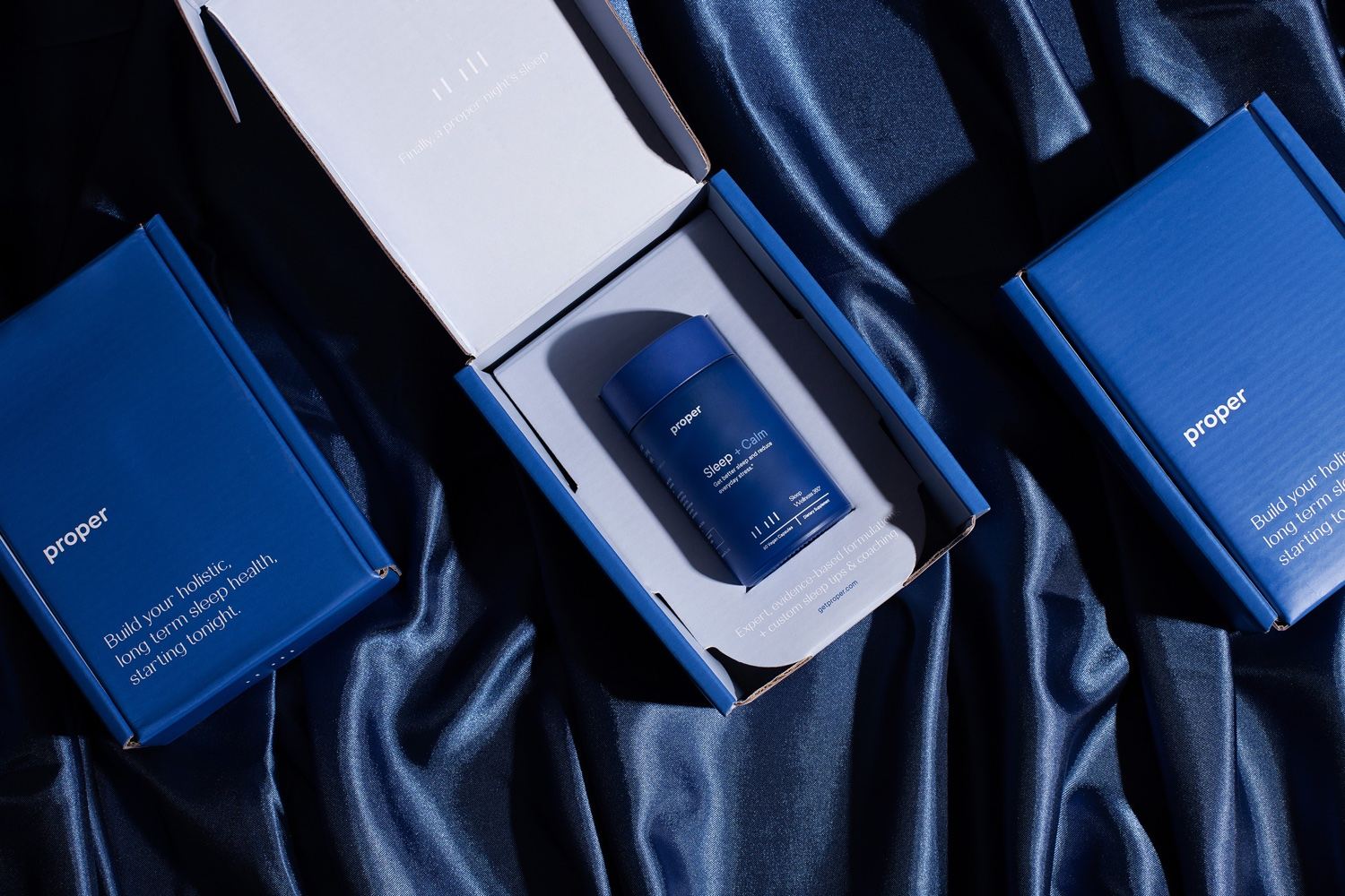
Sleep without frills — Proper sleep uses negative space to convey a clean, clear design system that is as smooth and care-free as the sleep you’ll probably get on it. The deep blues and san-serif under case logo design convey calm, allowing your shelf to be free of clutter and your mind to be clear of distractions at night.
Proper offers a better way to get to sleep. Your unique sleep issues require a modern, individualized, and holistic approach – Proper’s evidence-backed tips and coaching help you achieve and maintain long-term sleep health.
Proper’s brand identity concept is reflective of the product’s overall goals. For the wordmark, we chose a lowercase sans-serif with rounded corners for a clinical and attainable aesthetic. The 5 bar logo element pays homage to the decades of the 5 different stages of sleep studied. These five stages have different frequencies and durations which transition from stage to stage throughout each night. The blues in the color palette were chosen to call to mind calmness and tranquility, while the orange represents a vibrant and energetic feeling achieved after a night’s rest.
Get unlimited access to latest industry news, 27,000+ articles and case studies.
Have an account? Sign in


