Gruvi is Where Gelato Meets Bold Typography and Photography
by Shawn Binder on 09/15/2020 | 2 Minute Read
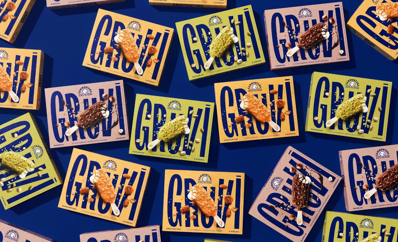
Take a big bite out of Gruvi, a groovy (had to) new gelato brand with a big crunch. The packaging has the product practically leaping off the paper, as kinetic images of the gelato bars crunching off the paper, spraying crumbs no one would want to waste! The funky typography brings another level of fun to the branding, and allows this brand to instantly stand out to consumers looking for a way to treat themselves.
Packaging design for a new, surprising ice cream bar by Sammontana. Put some groove in your gelato!
We created the identity of a new surprising ice cream bar: it’s soft, it’s creamy, it’s crunchy. Three different sensations for this unexpected and irresistibly, yummy gelato. We wanted to express the personality of the product and it's Italian “artisanal” quality.
We worked on the creation of naming, type design for the logo of the product, following art direction of the photographic shooting of the still, definition of the color palette for the four packaging references.
We chose the product name thinking the different tastes of the ice cream as a groovy beat. The logo design, the typography, the shooting art direction, they all express the idea of movement and the exuberance of the ice cream and its contrasts. Smooth colors on the background and a “soft touch” finishing for the pack oppose a bold blue (brand color) typography, a catchy type and a high-contrast photography. The result is a striking pack that embodies the essence of the ice cream and that feels as inviting as its content!
- Creative Director: Davide Mosconi
- Designer: Andrea Mastroluca