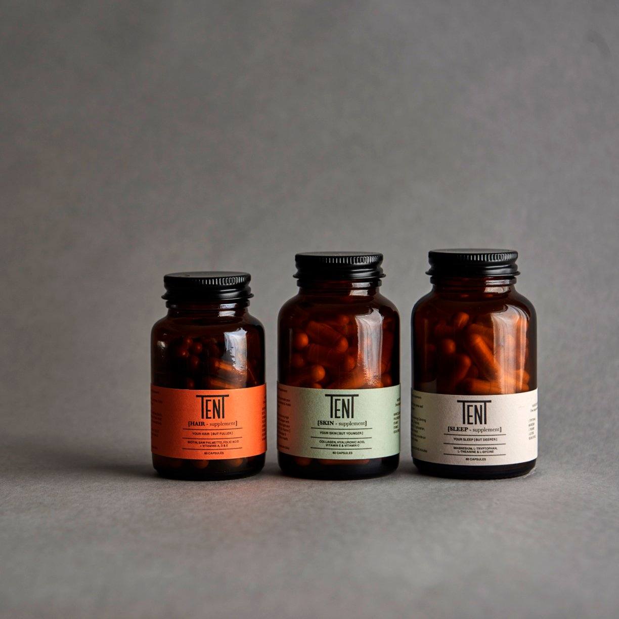
We’re digging this design project for TenT a concept brand around encouraging men to take supplements. The amber bottles and black caps are decidedly masculine, and the color-scheme is design-forward yet would appeal to their target demographic. Our favorite element is the logo, that uses two capital T’s to build a roof over the other letters; a tent, indeed.
This project was about creating a brand that would try to encourage men to take supplements. We also wanted to add some fun and design integrity to a category that is often just a plastic bottle with a poorly design plastic wrap.
We use glass bottle and a thick, texturized paper wrap. On our 1st product (pink with larger label) we looked to have some fun as it was a biotin (which helps hair growth) by naming it [Fol-i-kuh L] which is the phonetic spelling of follicle.