THIS IS IT! DIELINE Awards 2026 Late Entry Deadline Ends Feb 28
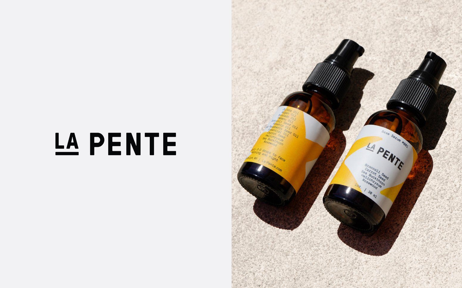
The straight-forward but arresting design for La Pente is instantly gratifying. The warm yellow stars that adorn the bottle look like they were drawn by hand, speaking to the small batch nature of the product. The type used is authoritative and gives the brand an overall mature feel, despite the hand-drawn elements.
Packaging and branding for La Pente — Brooklyn based skincare, creating serums using seasonal and local ingredients. By using raw ingredients, each small batch is unique.

Get unlimited access to latest industry news, 27,000+ articles and case studies.
Have an account? Sign in


