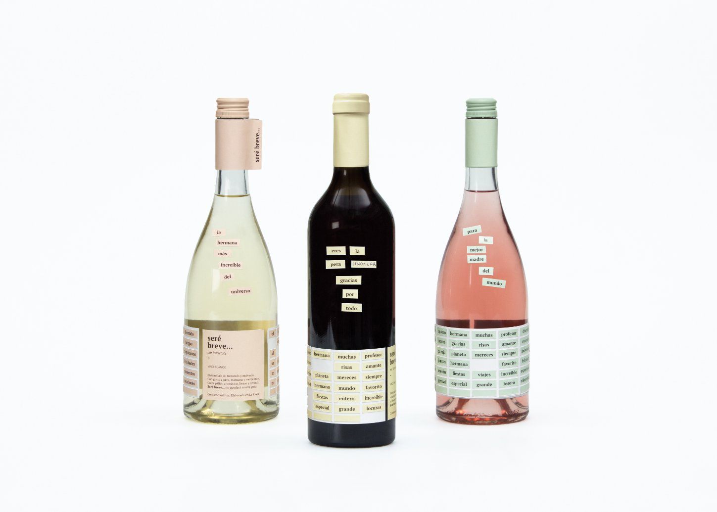
The bottle design for “Seré Breve” (I’ll be brief) is a beautiful exercise in minimalist, making it the perfect gift for anyone in your life. The labels give off the illusion of refrigerator magnets adorning the bottles — making it an approachable and fun bottle to bring to any occasion.

Since the design had to adapt to many profiles, a minimalist approach was used, inspired by the greeting tags that are often seen in gift wrapping, and have written messages such as “Happy Birthday”. The resulting label works as a sticker sheet. It is die-cut following a grid full of words, creating small tags that can be detached and used to form phrases. The last row was left blank, so the students can customize their gifts even more. We worked with soft colors, that contrasted with the color of each wine, to create a simple, straightforward and neat design. This is where the name of the wine collection originates, as givers express what they feel bluntly.