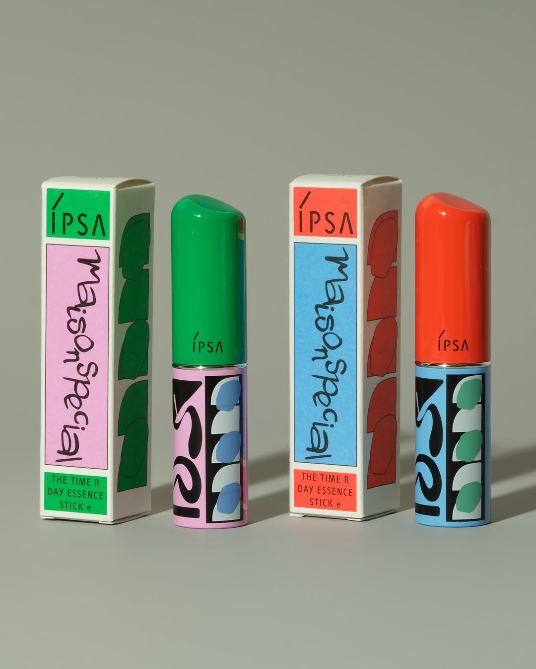

This tea brand is looking to attract a younger, hipper audience with its geometric design. The top of the package allows the futuristic typeface to stand out in stark contrast with the white of the label. This design choice allows each square depicted to give different information to the consumer.
The ridged circular shape allows the consumer to read which brand of tea they’re about to sip on, while the right side gives a visually appealing design formed by various shapes and colors. By allowing each tea variant to have its own futuristic pattern, Zuno has created a brand system with limitless potential.
The new Zuno Tea brand is the graphic manifestation of its cheerful and irreverent DNA that seeks to attract a new audience for its brand. To be successful in this strategy, we created packaging that communicates with this DNA. The Zuno Tea packaging brings its vibrant colors and a totally modern aesthetic with a message that questions the patterns of tea consumption today. Zuno Tea. Drink tea every day.

