Pack of the Month: We Loved This Fishy Concept From Linsanity Design
By
Published
Filed under
By
Published
Filed under
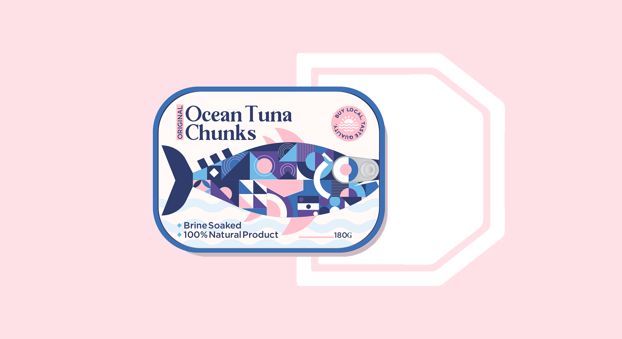
Canned fish packaging—be it kippers, sardines, or tuna—sports some of the best design in the grocery store. Whether it’s a heritage brand that hasn’t touched their packaging in the last 100 years, or it’s something from the far reaches of the world, those fishy treats are downright intriguing.
So, even when we see a concept—if you can really call it that—we can’t turn our eyes away. Linsanity Design (which sadly is not named after NBA star Jeremy Lin) crafted the packaging by not only using exquisite geometric patterns but brilliantly placing the pull tab over the eye of the fish.
We spoke with Lindsay Megan Silveira of Linsanity Design about how she created the visual identity of the mysterious brand for our November 2020 Pack of the Month.
Get unlimited access to latest industry news, 27,000+ articles and case studies.
Have an account? Sign in