Featured image for Pack of the Month: Oddly Celebrates Unloved Fruits and Veggies

Pack of the Month: Oddly Celebrates Unloved Fruits and Veggies

by Bill McCool on 10/30/2020 | 4 Minute Read

Nearly 12% of the fruit that gets sold in grocery stores—in addition to 11.5% of vegetables—will never get sold. It’s a damning statistic, especially in a country where 1 in 4 households experienced food insecurity in 2020.

Now, think about all of the ugly fruits and vegetables that don’t make it to the grocery store—half of what we grow in the US alone gets thrown away. That is why in recent years, Imperfect Produce and Misfits Market have grown in popularity, as both brands utilize fruits and veggies that would otherwise get tossed.

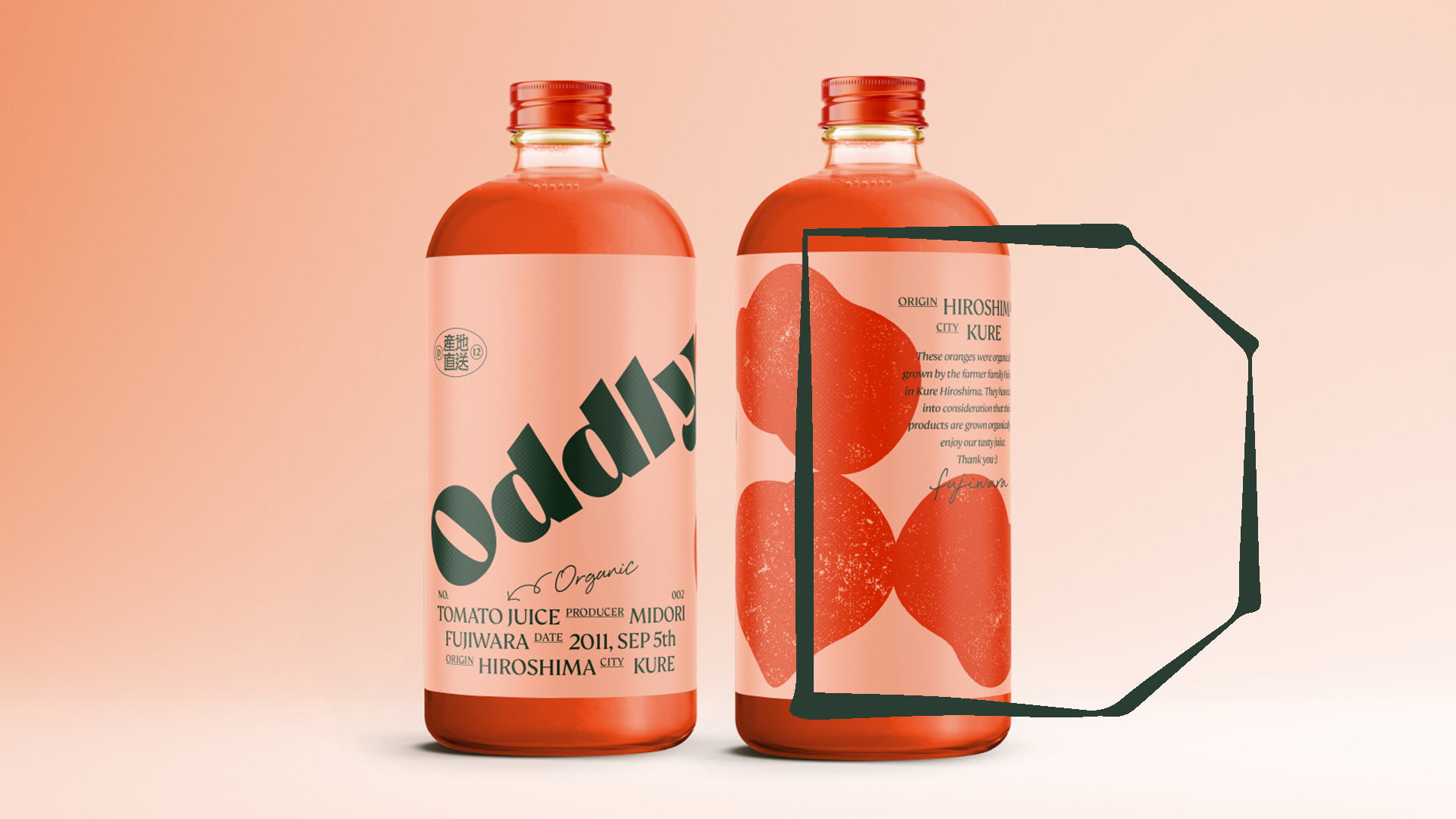
Over in Japan, Oddly Juice is doing something very similar. The company takes ugly produce and turns them into tasty beverages. And the brand even got a design-assist from a relative who takes these misshapen beauties and turns them into a celebration of the imperfect.

Editorial photograph

Jin Fujiwara’s grandmother is a part of the firm bringing these forgotten fruits and vegetables to the market in bottled form, and he approached her about redesigning their packaging so they could further expand their blossoming consumer base. Plus, he did the work pro bono—which, you know, what a mensch and good grandson! 

We spoke with designer Jin Fujiwara of Stamp about the inspiration behind the funky oranges, apples, and carrots that grace the packaging for Oddly.

Editorial photograph

Walk us through the design process that you went through for this project.

The packaging already had a label that only had the names of the juice, and I thought that I could make a unique thing about unwanted fruits. I didn't know what the concept of this was exactly, but I was drawn in by the strange shape of the vegetables and fruits, and I thought it could be “oddly beautiful.” That's how they are born—in a raw, pure form.

Editorial photograph

So, I thought we should use the ones that are “ugly.” That's how we came up with the name for the juice. 

Editorial photograph

What was one of the biggest goals you set out to achieve with Oddly packaging, and how did you accomplish it? 

Our goal was to help unwanted fruits and vegetables while stopping unnecessary waste that goes right in the garbage.

Editorial photograph

While the fruits and veggies utilized for the brand are "ugly" (or would otherwise get thrown away), the illustrations on the bottle are anything but hideous—they're beautiful and even a little abstract. Can you tell us more about the decision-making process on how you represented the fruits and veggies and why?

We didn't want to use a photo because it didn't have the right taste appeal for us. We would rather illustrate the veggies and fruits by their shape and silhouette. It's much more interesting than photos. Additionally, we added character to the illustrations, and if you look closely, some of the veggies have a wooden texture. It’s a small detail that we added to make the illustrations a little more close to nature.

Editorial photograph

Why did you select the Brule typeface from TypeEverything?

The dynamic shape of the letterforms reminded us of the fruits and veggies. We recommend everybody use it because it's absolutely beautiful! All of TypeEverything’s fonts are stunning!

Editorial photograph

What was the most challenging part of this project?

I would say the decision to use an illustration on the bottle. Plus, my grandmother and her partners didn't have a clear view of what they were looking for, so I had to show some examples of other juice packaging and illustrations to figure out what they liked visually. That was the also most challenging part of the project since they had no experience in buying designs.

Editorial photograph

If you could pick one aspect of the finished design that you like the most or feel proud of, what would it be, and why?

I love the diagonal logo that’s placed weirdly. We didn’t want to treat the logo in a traditional manner. The Oddly logo is not a holy device that nobody can touch—they’re not a big, corporate brand. It's a logo that is placed oddly, just like the fruits and veggies.

Editorial photograph

Share one lesson that you learned while developing the finished product.

Just because everybody thinks it's ugly doesn't mean it's the truth. It's just a matter of how you change your perspective to look at things.