Featured image for Sebestyén Winery Can Be Funky And Sophisticated At The Same Time

Sebestyén Winery Can Be Funky And Sophisticated At The Same Time

by Shawn Binder on 10/20/2020 | 2 Minute Read

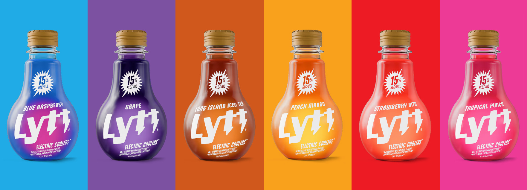
Sebestyén Winery has a brand design that isn't afraid to get funky.

The abstract shapes that adorn each flavor variant are fun without being too youthful. Each offering has a distinct color palette and feel, while still connected to the overall brand identity. The colors are rich, attention-grabbing, and bright enough to appeal to every type of consumer.

This is a wine brand that is sophisticated, but isn't afraid to let loose. Big same. 


Wine label design for Sebestyén Winery from the wine region Szekszárd, Hungary.

This small family winery led by a brother and sister duo asked us to create a series of redesigned labels for some of their most popular wines.

Editorial photograph

Our aim was to create a very clean and easy, yet attention-grabbing and playful design that we felt fits best for the characteristics of their wines. Our main concept was to create a visual system that is based on organic shapes from nature, supplemented by a clean, classical typography. Every label features one the the winery’s foundational values, symbolized through natural elements of the vineyard and the region. The colour of the main abstract form reflects on the flavors and characteristics of the wine, while some transparent shapes give a little extra touch to the final outcome.

Editorial photograph

By combining different printing finishing, we wanted to create an elegant packaging with a strong character.

Editorial photograph

Share

Facebook Twitter Email