Dimple’s Vision for Design is 20/20

Published

In Australia, four manufacturers control 97% of the contact lens market. With this monopoly, there has been little to no effort required to brand their products. Before Dimple, a new contact lens delivery company, packaging has always been designed with the optometrist in mind, storable and stackable, leaving a sea of white, clinical branding lacking any connection with consumers. 

Dimple is here to disrupt that dinosaur model. 
Editorial photograph

The challenge Dimple proposed to Australian design agency Universal Favourite was to create a new, consumer-focused product addressing the need for individuality that most millennial consumers want out of a lifestyle brand. 

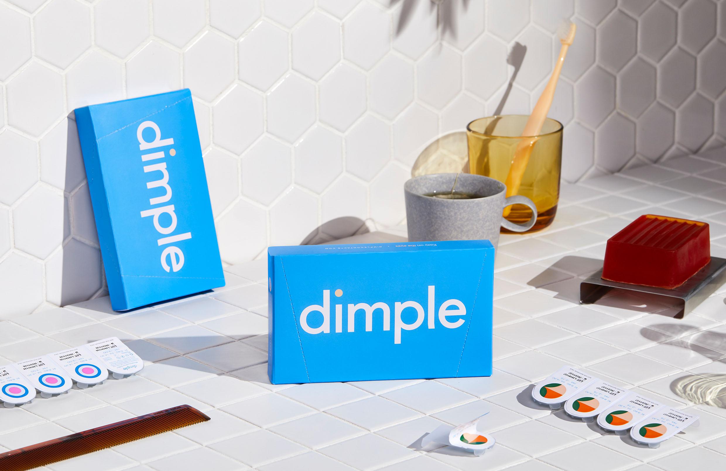
Universal Favourite not only accomplished their goal with Dimple’s branding, but they’re also showing the market just how 20/20 their vision is. The box is a light blue, adorned with a san-serif white font reading  ‘dimple.’ The brilliance of the paired down outer packaging is in the text-based logo itself with the ‘i’ in dimple being orange to represent the shape of a contact lens. 

Editorial photograph

One of the unique and hypnotic features of Dimple’s design is that every different type of contact lens package is designed differently, to speak to both the individuality of the product, and give the consumer a sense of self within the purchase.

“The branding taps into a flaw in existing contact lens blister packs,” Universal Favourite founder Dari Israelstam said about the work. “We created customer pattern (IDs) for each individual power number and displayed them boldly on each blister, which makes it significantly easier for users to identify the pack that’s specific to each eye, especially when they don’t have their contacts in!”

Editorial photograph

The decision to use a vibrant palette grounded by the blue helps to find a balance between premium and affordable, and then lifestyle and medical. The typefaces are friendly yet versatile, perfect for a young direct-to-consumer brand. Finding that balance was critical for both Dimple and Universal Favourite, an occasion they both rose to beautifully.  

Editorial photograph

Since Dimple is a contact lens company, designing the package itself meant that Universal Favourite would need to work through all the regulations put in place for a medical product.

“We were fortunate to have worked with the team at Gelflex Laboratories, who were as excited as we were about shifting the industry norms to create a beautiful packaging solution,” says Universal Favourite Creative Director, Dari Israelstam. “For example, as a standard rule, mandatories are applied to all blisters in a row. However, we were able to consolidate mandatories to one blister in every row, allowing the remaining blisters to showcase the circles. It’s a clever way to find a solution while working within strict, regulatory guidelines.” 

Editorial photograph

“We also wanted to create a striking box shape that could sit side-by-side with other brands within our audience’s environment,” he says. “We worked to a “shelfie” rule; would our audience want to keep the box out in the open, rather than packed away in a drawer or cupboard? The structure that we developed is very different from the standard shape used by most other manufacturers, which are designed for optometrist storage rather than the end-user.” 

Editorial photograph

The result is a brand ready to disrupt the contact lens monopoly in Australia in stunning fashion. Of course, with all that gorgeous packaging, we had to ask what sort of recyclable initiatives is Dimple chasing? The answer is that all materials, from the product boxes, sleeves and mailers, were 100% recyclable. 

Editorial photograph

“We supported this with key messaging throughout the user experience to provide additional education on the importance of responsible recycling of packaging, as well as  information on the disposal of lenses,” says Israelstam, proving that Dimple’s tagline “your eye, sorted” is more than an assurance your sight will be great, it’s a promise that your branding experience is going to stun. 

The beautiful of Dimple’s design is the fact that it all seems so effortless, all while actively listening to their audience and nailing the packaging regulations with ease. Dimple makes individuality intentional, and you can’t help but adore that. 

Editorial photograph

This placeholder is removed when the ad slot is configured.

This placeholder is removed when the ad slot is configured.

This placeholder is removed when the ad slot is configured.

This placeholder is removed when the ad slot is configured.

This placeholder is removed when the ad slot is configured.

This placeholder is removed when the ad slot is configured.