Create The Ultimate Picnic With Breana's Toast
by Casha Doemland on 07/29/2019 | 2 Minute Read
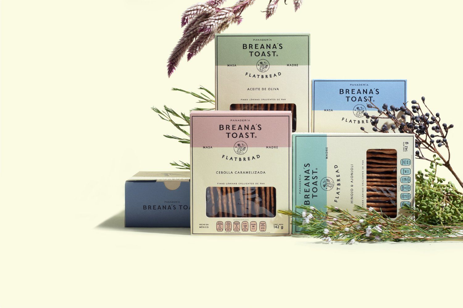
From the moment we saw the photography and branding of Breana's toast, we knew this was a brand to keep our eyes on. The color palette, the illustrations, and simplicity all play well together and create a beautiful aesthetic.
"Breana's Toast is a bread-based brand with a family bond in the backend. The brand looks for those who seek products made slowly, respecting both the process and the full potential of a raw ingredient."
"We worked the re-branding and packaging design of the product having in mind the creation of a premium product brand, that could also be approachable."
"We wanted to remind the consumer that there is a feminine force behind the project. We know that the future is female but so was the past when Breana's Toast started. We opted for an ancient feminine symbol, a greek inspired goddess with a posture that signifies the importance of women in the work field. Breana's strength surpasses the body, it stays away from the physical realm. It is the representation of continuous transformation, it is the stamina of being on your feet next to the heat of the fire."
"The overall concept revolves around the importance of quality ingredients, the strongest bond in humanity which is the one between a mother and her daughter and the strength behind a project ran by women. Breana's Toast is a token for those who enjoy the pleasures of sharing a table. All this trough an aesthetic that could evoke the nostalgia of classic times with a strong modern twist."
- Agency: Toro Pinto
- Copywriting: Olga Villegas & Karen Vizcarra
- Art Direction: Mario Hgno
- Design: Nubia Fernández & Mario Hgno
- Illustration: Nubia Fernández
- Photography: Fredy "thecat" Morfín