Mageze Soothes Sore Muscles & Aching Pains
by Casha Doemland on 02/05/2019 | 4 Minute Read
If you're an athlete or even just active, chances are you experience muscle aches and pains every once in a while. While a good, deep stretch or a trip to an ice bath or hot sauna can do the trick to soothe the muscles, sometimes you need a little help from a supplement to take the pain away.
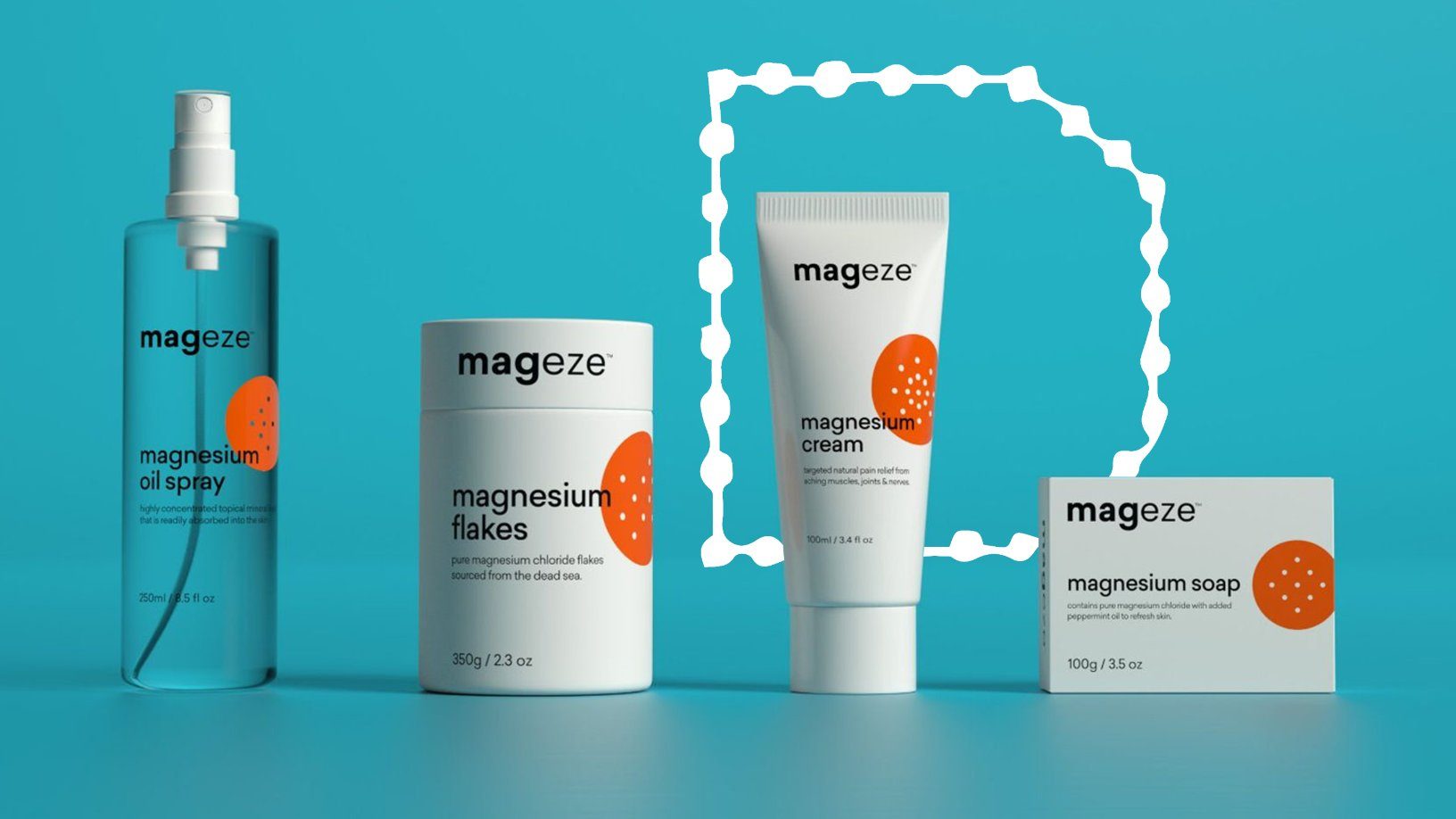
Not only does Magnesium help the cells relax after contracting, keep your ticker healthy, lower blood pressure and maintain brain function, it's also the focus of DPP Pharmaceuticals' newest product line Mageze.
To help Mageze stand out on the shelf and be visually appealing yet unexpected at the same time, DPP returned to their trusted design agency Date of Birth. We spoke to designer Michael Nguyen to learn more about how they brought DPP's vision to life.
Walk us through the design process. How did you go from start to finish on this project?
When we began the project, we had an initial design meeting with the client to discuss their brand story and what they wanted Mageze to represent. Here they defined their demographic as younger and health-focused and that they wanted to create a product that would have a distinct brand personality from their competitors. This information helped form the foundations for design decisions throughout the process.
We then entered our discovery phase where we worked with the information given by the client to begin developing a unique brand for Mageze. We looked at existing competitors in the market and found that many of them did not have a strong brand identity which provided an opportunity for the brand.
Through a series of design iterations, we developed a clean and minimal design language that utilized pharmaceutical product labels and first aid kits as the inspiration. We liked the clean look of first aid kits and felt that a simple color scheme would assist with the client’s desire for high shelf presence and create a visually striking design. The connotation of creating a product that utilizes the design language of pharmaceutical products also assists in creating brand trust and reliability when viewed by consumers.
What is the significance behind the bright splash of orange—both color and design?
We wanted to use a striking color for Mageze that would create a strong and memorable brand identity that was easily recognizable on-shelf. We chose orange not only for its vivid tone and ability to evoke a strong sense of health and vitality but also for its reference to pharmaceutical design language (e.g., first aid kits, prescription medicines, pill bottles and health guidelines). We wanted it to evoke a sense of trust and reliability and importantly, injury protection.
Tell us about the clear identity system you created to distinguish the different uses and applications of the products. What was the process behind this, as well as the end result?
To create a strong and memorable brand, we created an identity system consisting of simple color schemes, type choices, information hierarchy and layout that could be used consistently across all packaging.
On initial design drafts, we presented each product in the range with a unique color so they could be distinguishable but found that this diluted the strength of the brand. With magnesium the key ingredient across all products, we opted for a single brand color to create a stronger personality.
Then, to create differentiation across the range, we developed an icon system of shapes with dots to represent how each product is used. For example, a spraying action icon for the Mageze oil spray, and the flakes icon represents the salts in the water. They utilize similar elements, so they look cohesive while still representing individual product uses.
Share one lesson that you learned while developing the finished project.
One of the lessons we were reminded of throughout this project was the strength of creating a great working relationship with the client – this is key for creating a finished product that both parties are happy with.
At times, it can feel easier to do things in isolation or try and force an idea, but continuous communication and collaboration create mutual trust and respect.
Our client trusted our design expertise. We respected and trusted their objectives and direction, which allowed for a smooth process. It also allowed us to push boundaries and ideas while successfully creating a visually distinct and strong brand for Mageze.