THIS IS IT! DIELINE Awards 2026 Late Entry Deadline Ends Feb 28
KittoKatsu Bucks The Skin-Care Design Aesthetic, Helping Brand QiQu Stand Out.
By
Published
Filed under

By
Published
Filed under
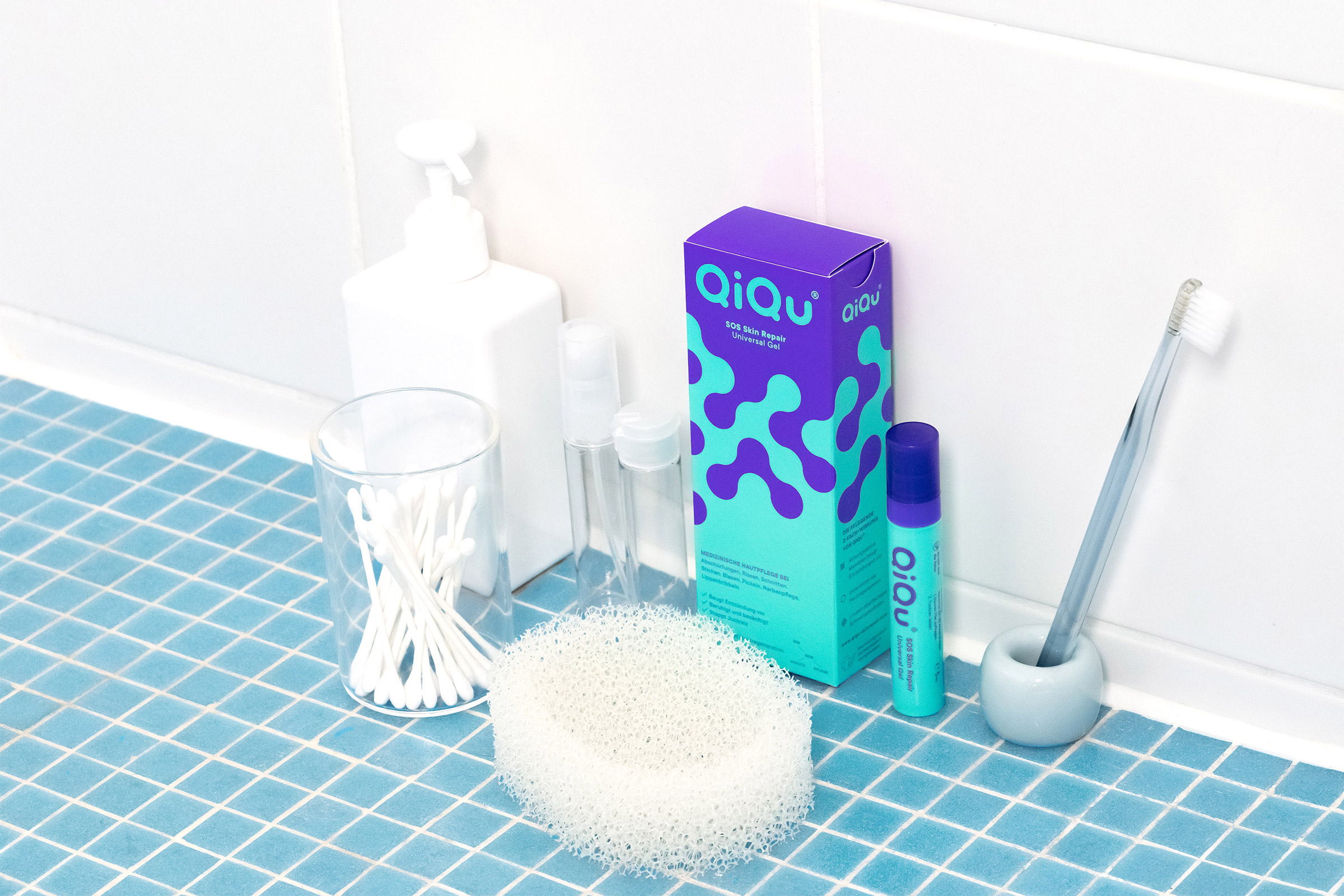
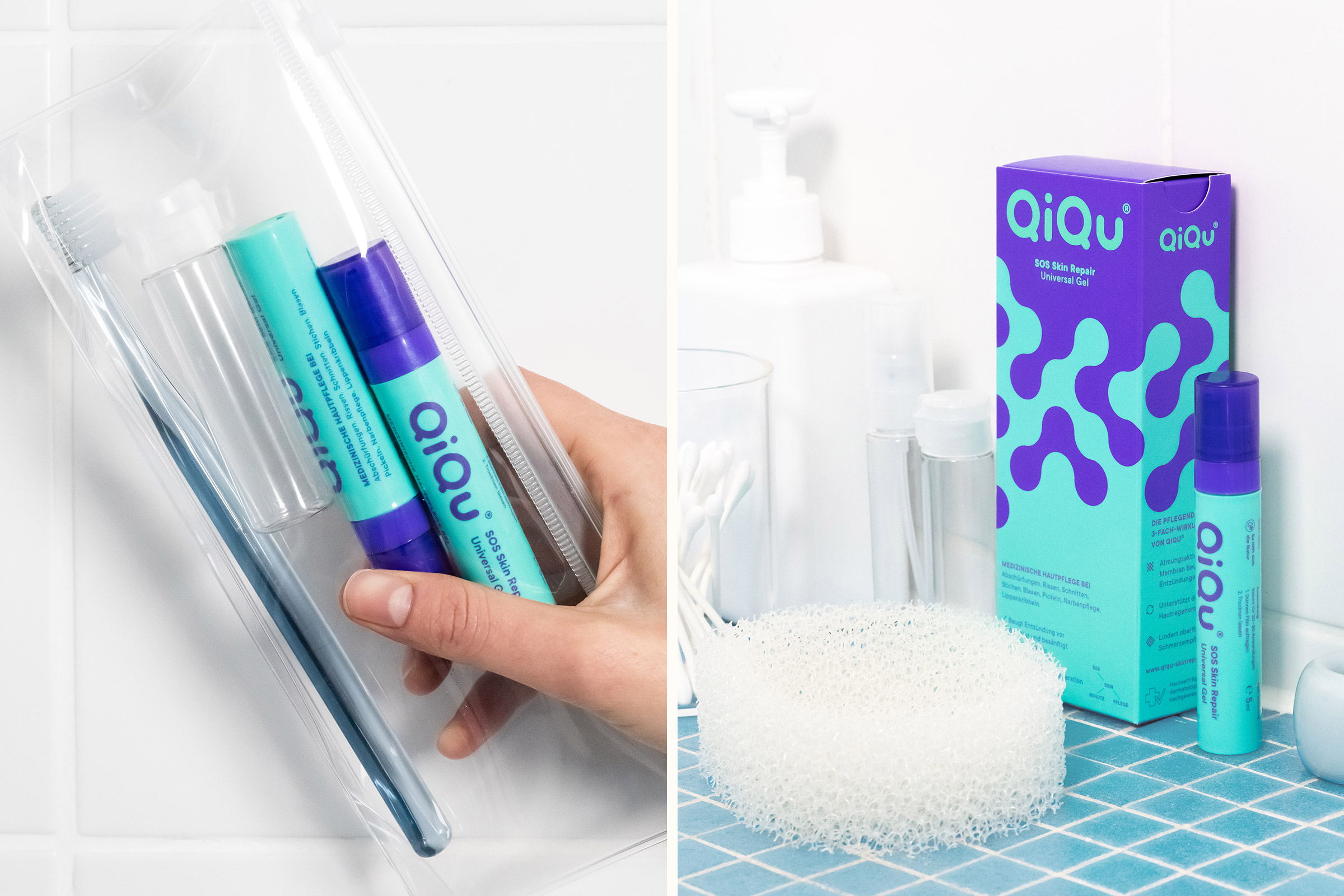
Instead following the typical skin-care aesthetic, the creatives at KittoKatsu went against the grain, using bold colors and designs which reference the functionality of QiQu’s restorative qualities.
Get unlimited access to latest industry news, 27,000+ articles and case studies.
Have an account? Sign in


