Featured image for Taste of Tainan A-Sha

Taste of Tainan A-Sha

by Casha Doemland on 10/23/2018 | 2 Minute Read

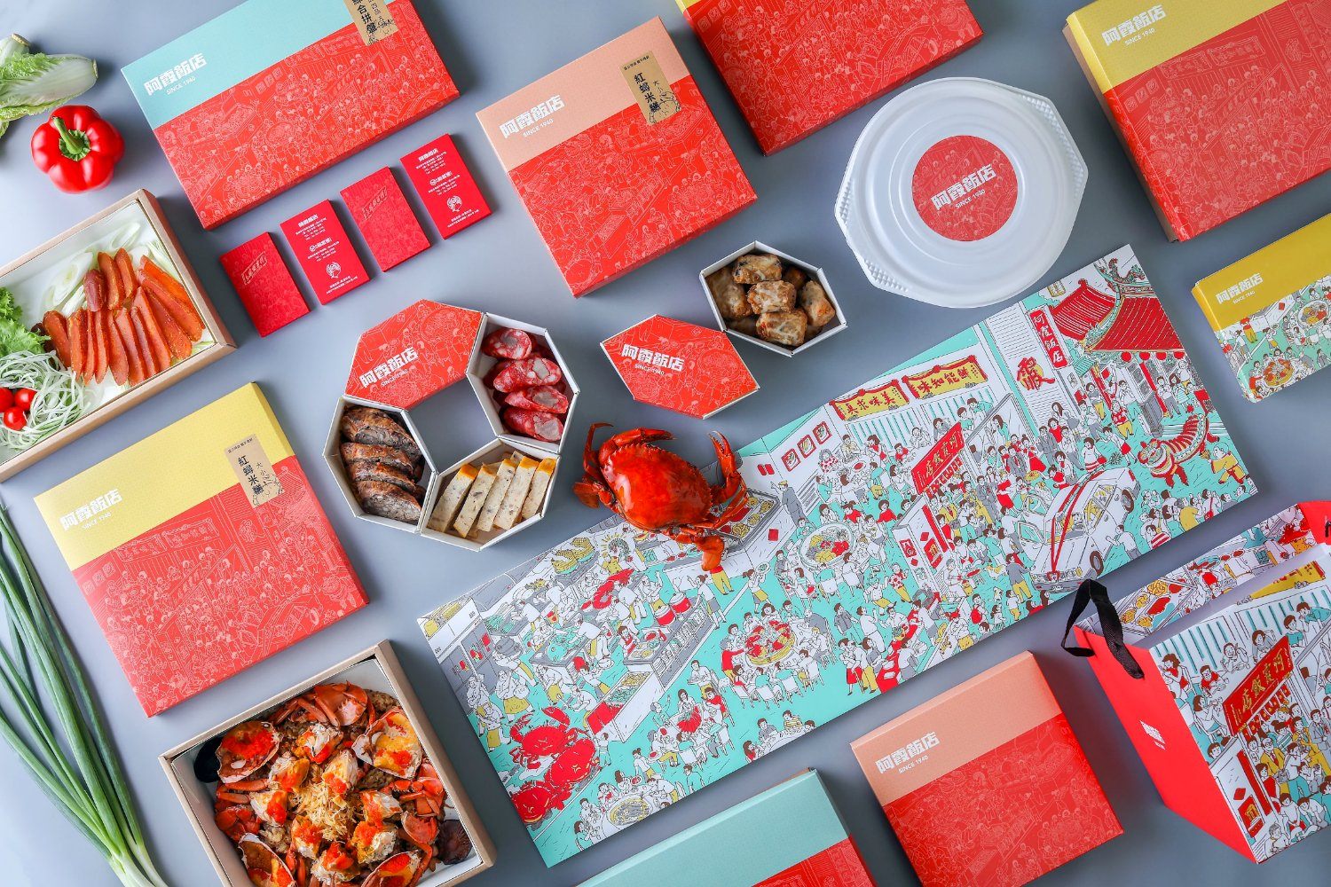
Pili Wu designed packaging for A-Sha restaurant, JINXIA that plays well in bulk as well as individually. Each design features a cartoon scene illustrated with a white outline on a red background, with thick white text for the name.

Editorial photograph

Started in 1940 and hidden in the back alley of Tainan, the A-Sha restaurant, also known as JINXIA, is still in a hubbub of voices. Every single delicious genuine Taiwanese cuisine, such as the resounding Steamed Fresh Crab Roe on Glutinous Rice and the Charbroiling Mullet Roe all represents the memory of all the foodies.

Editorial photograph

This project planning is aiming at brand packaging and visual coordination. In terms of the visual coordination, we use new types of colors and drawings to depict the wonderful time when people in Tainan gathering at the A-Sha restaurant from the wedding day till the three generations enjoy together. This beautiful memory and drawings also record the moment when chiefs offering their guests one after another with delicious dishes and warm smiles.

Editorial photograph

The design of takeaway packaging is origin from the “window blossom,” reacting to the various Taiwanese cuisine and food platters, appearing in a Hexagon shape with large, medium and small sizes, allowing you to mix and match diverse garnishing and food presentation with the different season.

Editorial photograph

The design of A-Sha logo remains the handwriting typeface that has been in use ever since 1940. While we use the representative color, red, to integrate the product series and to enhance its recognizability, this traditional brand is invigorated by the refreshing atmosphere and vitality.

Editorial photograph