Concept: The Lazy Farmer

Published


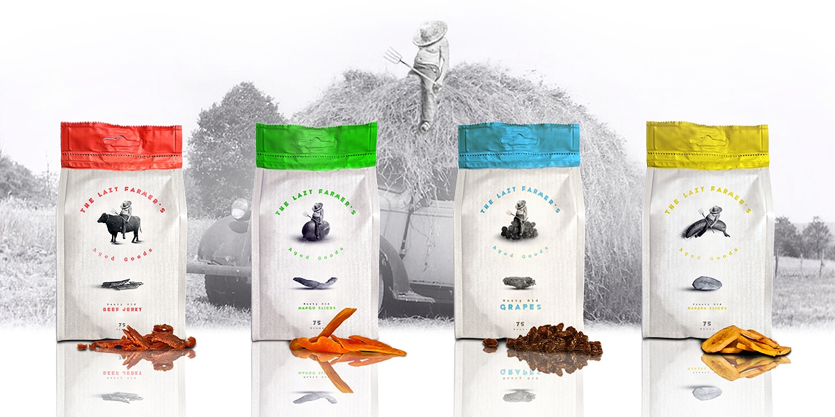
“You say lazy, I say patient.” We’re loving this funny and clever packaging concept idea of dried foods from Simen Wahlqvist. The Lazy Farmer is a line of dried snacks that are packed full of humor. By creating the story that the farmer for the products has little ambition, and therefore his foods all age and get dried up, consumers have an endearing and comical character that connects them to the brand.

“The idea behind it is that this brand that makes all sorts of products that are aged, dried or fermented in some way or another. The Lazy Farmer is featured relaxing on each package as he waits for the products to age sufficiently. I wanted to create an idea that this slob is so lazy that the only farm work he is good at is waiting for things to dry! But as he points out on the back of the package, it is his patience and not his lack of energy that makes a good aged product.”

A snoozing, shirtless farmer is on the front of each package, ignoring and sitting atop images of fresh, perfectly ripe foods. The bags almost have a weathered look to them, and the sides are clear to allow buyers to take a peek inside at the final product. Two fonts are used: Whoopass and Courier Bold, which complement each other well. The Lazy Farmer products only list the necessary information on the back, including nutrition facts and ingredients, keeping the appearance simple. The brand combines bright colors, humor, and a story effectively.

Each snack has a seemingly negative adjective associated with it, like “musty” or “dusty,” but paired an image of some mouthwatering dried mango slices or beef jerky, for example, this creates irony — almost as if the farmer believes he is selling a bad product that’s been sitting around too long. The top of the bag tears off easily and reseals with a simple zip closing, which is perfect for lazy eaters who just want to have a tasty mid-day snack!

“These are some rough drafts and sketchings I did early on in the idea process. The working title was ‘Lazy Lad’s’ in the beginning stages. I eventually chose the ‘Farmer’ name to make it more clear what this guy actually has a job to do. A lazy job maybe, but someone has to be in charge of aging the products.”

“The dry-snack market has heaps of products and they usually fall into a variation of the following categories that I choose to call: American Machismo Classic, Health-crazed Female, Noisy Generic, and Mundane Generic. If I wanted my product to stand out, I felt I needed to bring some humour and a bit of narrative to the design. A minimalistic approach to layout was also important to make my series distinctive.”


Designed by Simen Wahlqvist

Country: Norway

City: Oslo

This placeholder is removed when the ad slot is configured.

This placeholder is removed when the ad slot is configured.

This placeholder is removed when the ad slot is configured.

This placeholder is removed when the ad slot is configured.

This placeholder is removed when the ad slot is configured.

This placeholder is removed when the ad slot is configured.