Before & After: Supercult Elevates Wight Tea with Bold Colors and Premium Packaging
By
Published
Filed under
By
Published
Filed under
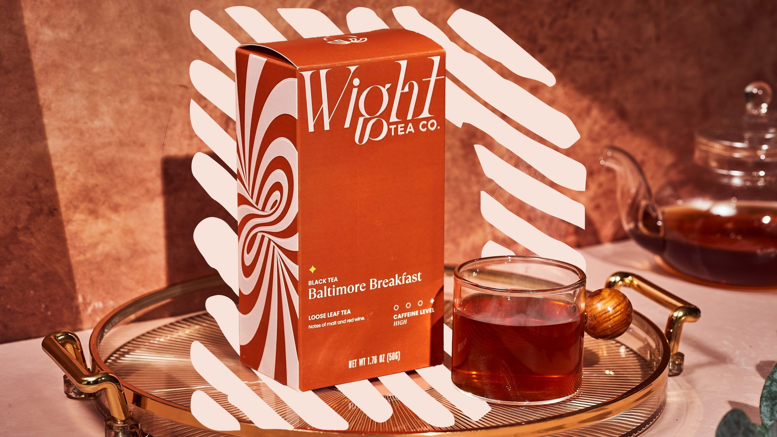
Supercult has super-transformed Wight Tea’s packaging, emphasizing a bold, flavor-forward experience with vibrant colors and a high-contrast logo. The new identity positions the upstart tea company as a premium, experience-driven brand.
Take a look at the incredible brand transformation below.
Get unlimited access to latest industry news, 27,000+ articles and case studies.
Have an account? Sign in


