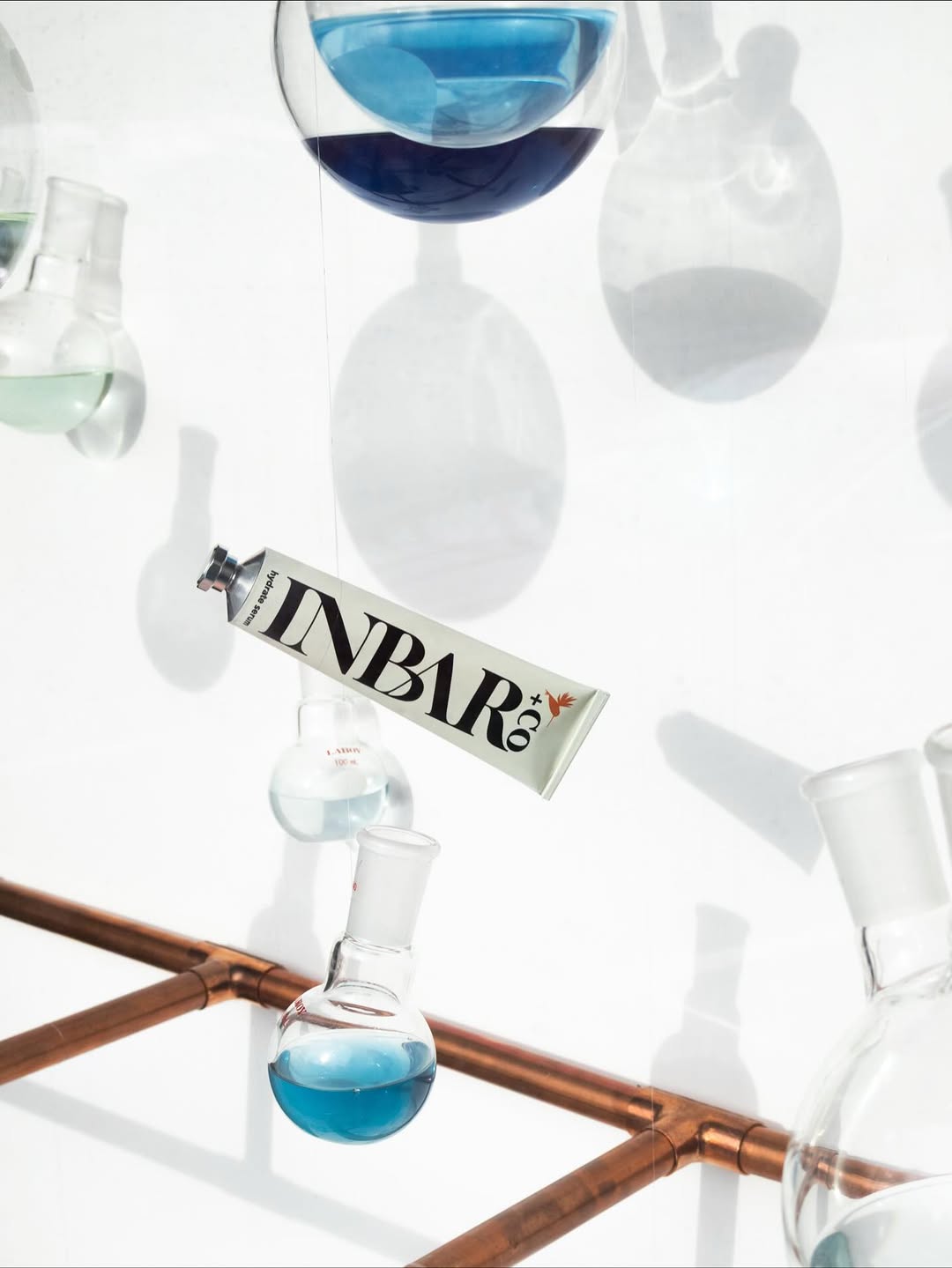
INBAR+Co Shows Good Skin Starts With Good Chemistry
By
Published
Filed under
By
Published
Filed under
INBAR+Co leans into oversized serif typography that runs the length of the tube, turning the name into the graphic. The stark white space and restrained color accents nod to apothecary culture but skip overused wellness clichés for an editorial look and feel.

Get unlimited access to latest industry news, 27,000+ articles and case studies.
Have an account? Sign in


