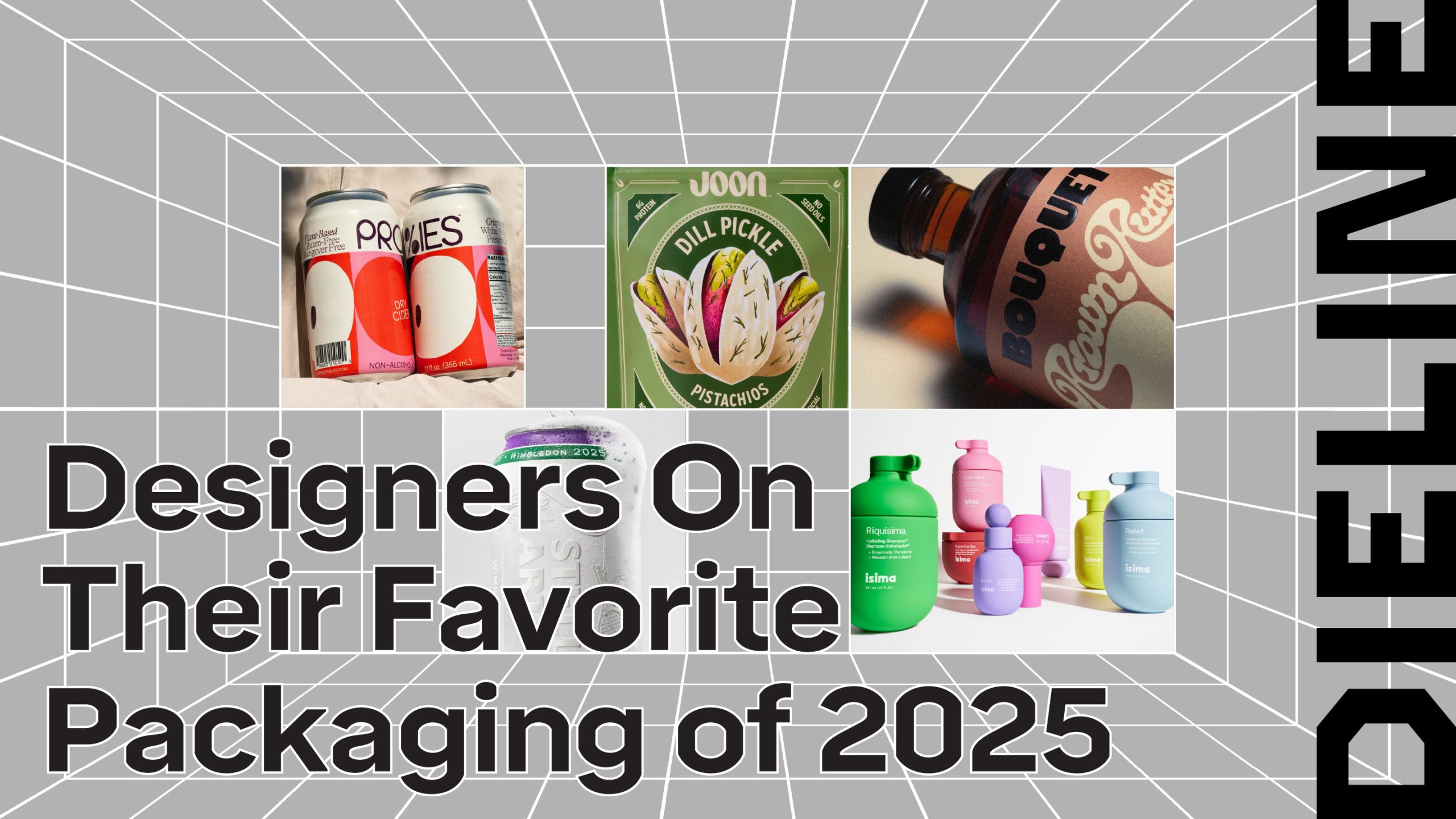
Ipsa’s Holiday Packaging Ditches Seasonal Tropes and Opts For Whimsy
By
Published
Filed under

By
Published
Filed under
Ipsa’s holiday packaging, designed by Bangal Dawson, leans into a bright confidence that feels deliberately at odds with what we typically expect from seasonal releases.
Rather than defaulting to the usual holiday signals with metallics, deep reds, winter motifs, or gift-ready elegance, the design leans into Ipsa’s core visual language. Bangal Dawson pairs funky typography with playful patterns of dots, blocks, and hand-drawn marks. Saturated coral, mint, and blue are the main colors, cleverly different the typical reds and greens of the season. Ipsa’s approach feels smart, system-driven, and refreshingly comfortable.
Get unlimited access to latest industry news, 27,000+ articles and case studies.
Have an account? Sign in