1954 Local Spirit Is A Design That Raises the Bar Without Lifting a Glass
By
Published
Filed under
By
Published
Filed under
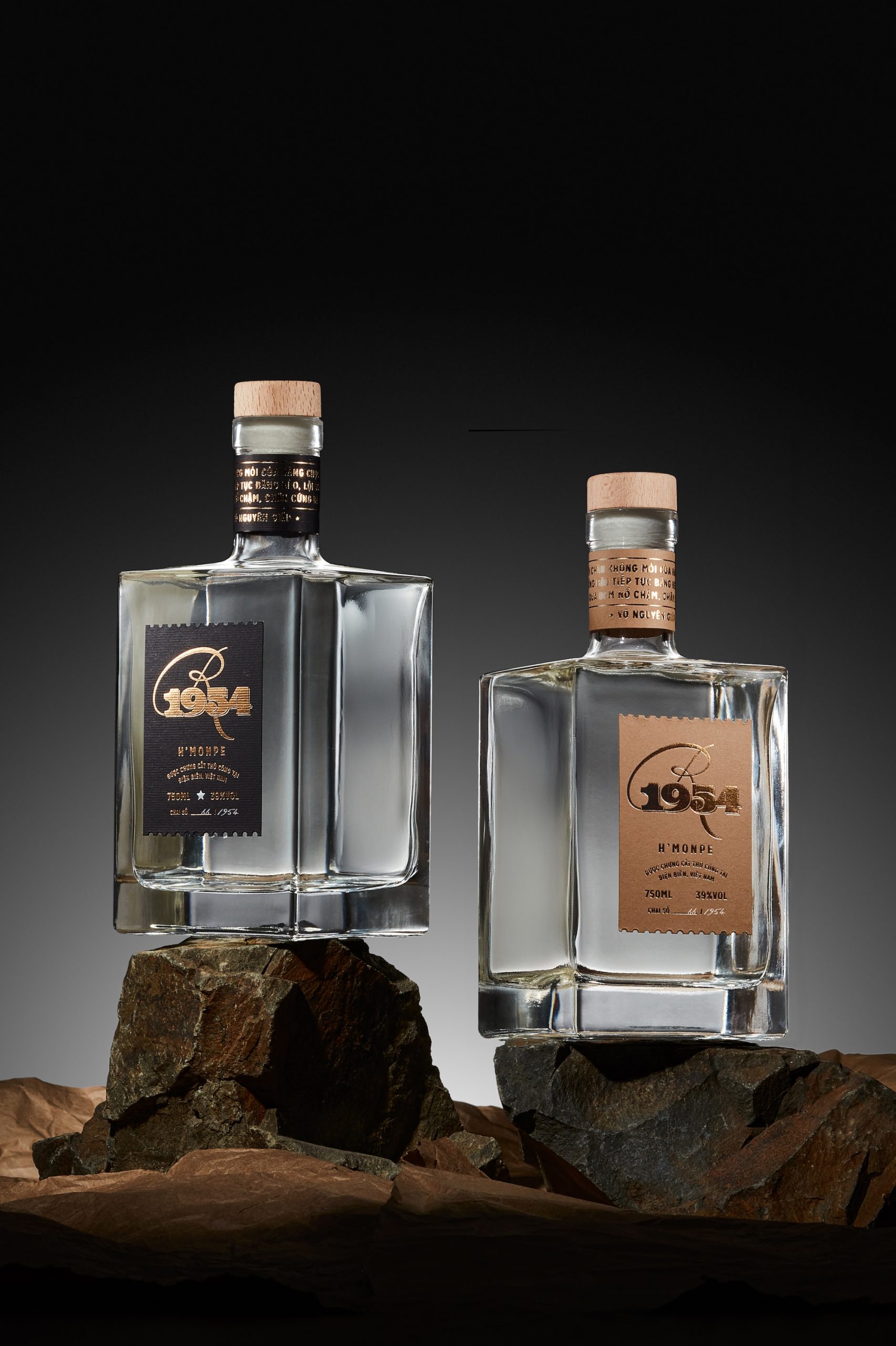
Studio CoHe’s packaging for 1954 Local Spirit leans into a square bottle that feels intentionally sculpted. The typography mixes a sweeping script with blocky numerals, echoing mid-century posters and old postage marks, especially with the serrated label edges.
The outer box opens like a triptych, revealing illustration work, something rarely seen in today’s spirits market. While most brands chase minimalism, 1954 turns the bottle into a small-scale artifact, rooted in storytelling rather than trend.
Get unlimited access to latest industry news, 27,000+ articles and case studies.
Have an account? Sign in


