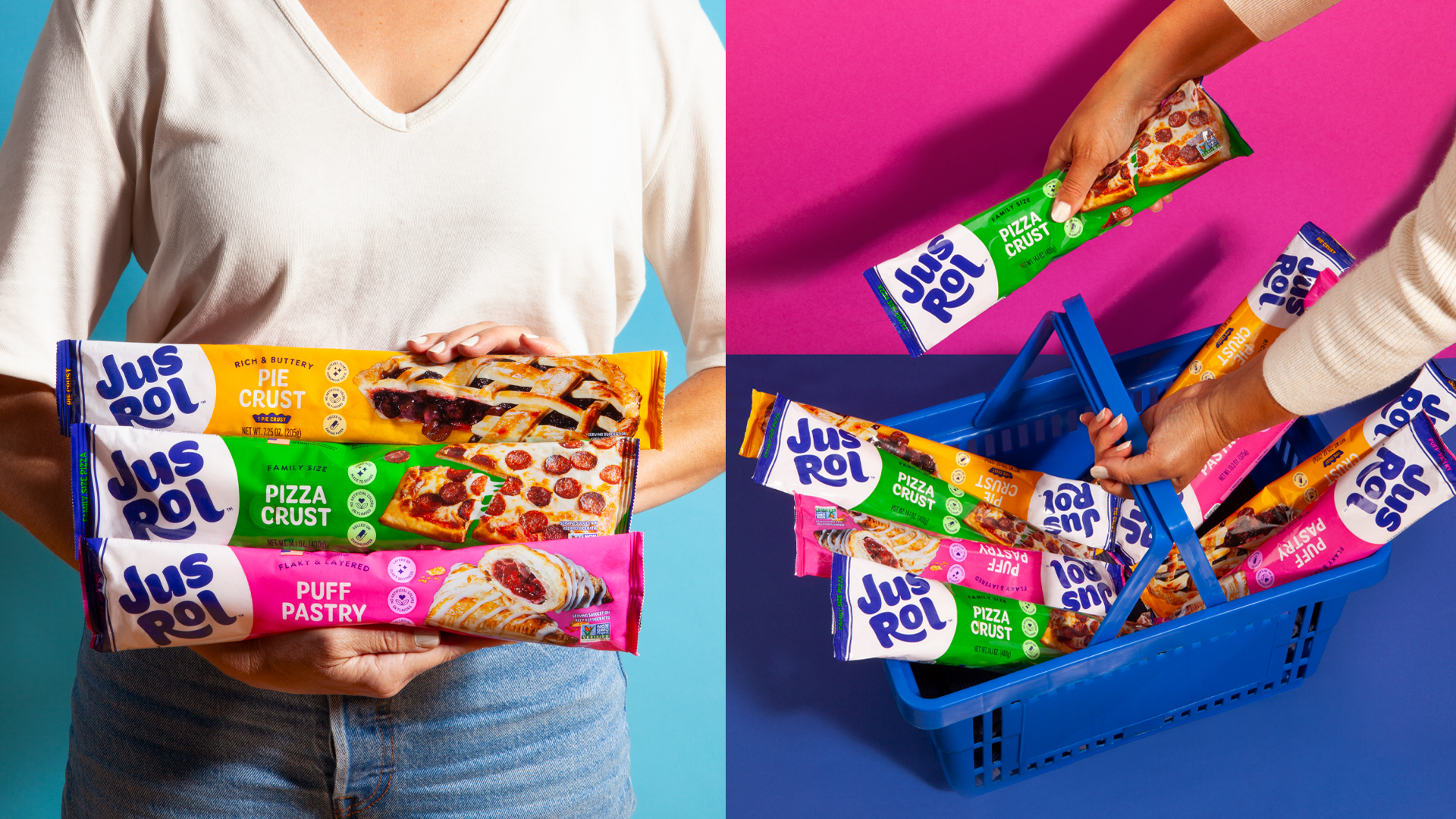

OAF’s bread packaging, designed by Into the Light, feels like a playful punch to the morning routine. The oversized bubbly logo bounces off the wrapper, framed by bold color blocks in electric blue and bright purple.
Big cartoonish eyes peek out from behind the bread like they’re up to something mischievous. Chunky, rounded typography paired with energetic colors makes the loaf stand out on shelves and gives it a personality that’s more snack mascot than humble bread.
It’s fun, loud, and totally unexpected, especially from a bread brand.
