THIS IS IT! DIELINE Awards 2026 Late Entry Deadline Ends Feb 28
Stokey’s Packaging Highlights The Charming Essence Of The Brand’s London Shop
By
Published
Filed under
By
Published
Filed under
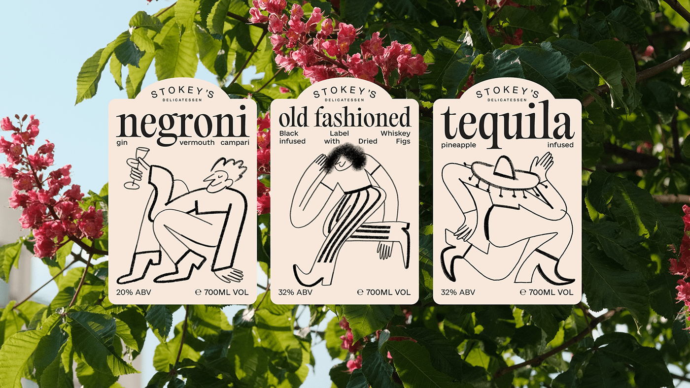
Katalina Maievska’s packaging design for Stokey’s spirits highlights the essence of the quaint London shop. Located on a charming, friendly street where the owner is a familiar face in the neighborhood, the packaging needed to mirror the craftsmanship and vibrancy of the owner. Lowercase typography adds an approachable and down-to-earth quality to the design, while whimsical portrait illustrations on the label’s front infuse an animated charm. The absence of color in the design lends an element of sophistication, highlighting the craftsmanship of the pre-packaged cocktails and encapsulating the spirit of this delightful little shop in the heart of London.
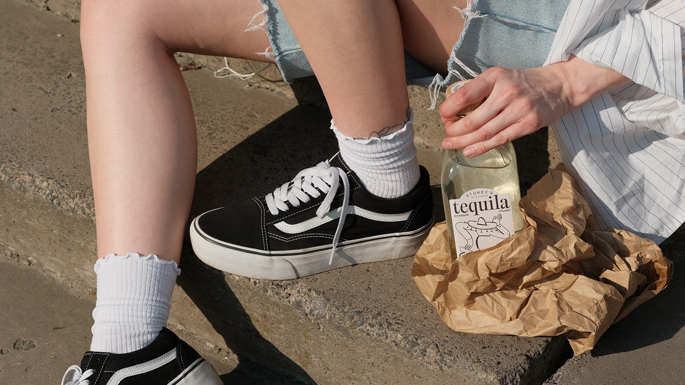
Stokey’s is a charming little shop nestled in the heart of London, offering a delightful array of craft, farm, and natural products.
Get unlimited access to latest industry news, 27,000+ articles and case studies.
Have an account? Sign in