Fruit Smash Hard Seltzer’s Irreverent Packaging Is Making Waves
By
Published
Filed under
By
Published
Filed under
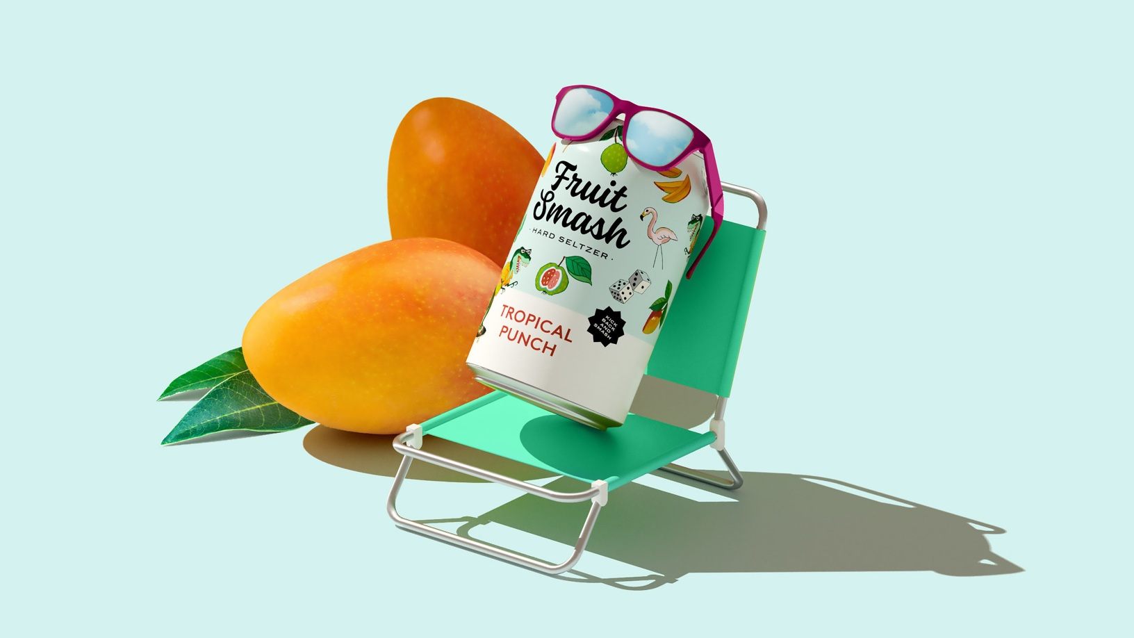
Packaged in irreverent, lively, and spirited cans Fruit Smash’s packaging system instantly catches the eye. Enlisted Design developed the design with personality in mind, and the playful characters displayed on each of the flavored cans create an approachable system. Additionally, the cursive typography and sweet illustrations work with the packaging to create a warm system.
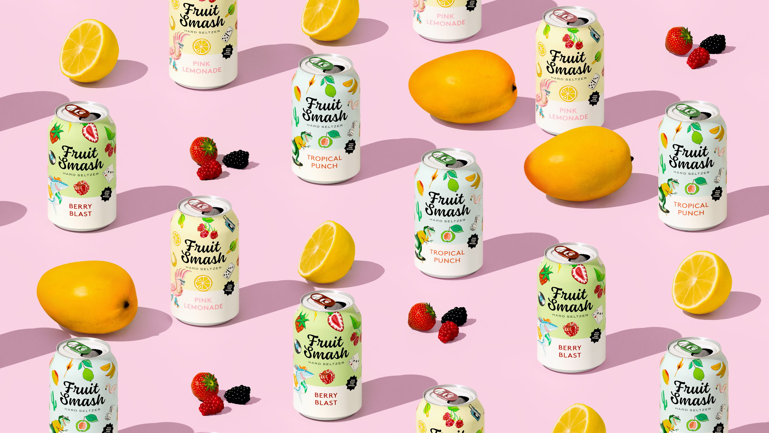
Enlisted was approached by New Belgium Brewing Company to help launch a new hard seltzer line, Fruit Smash. We set out to design brand visuals and packaging that would communicate flavors in a fun, fresh way that’s unexpected and on-brand: bold, ridiculous and irreverent.
Get unlimited access to latest industry news, 27,000+ articles and case studies.
Have an account? Sign in


