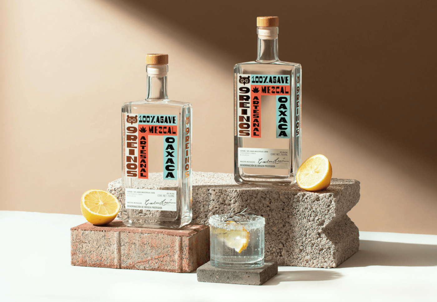
Espina Studio gave 9 Reinos a funky, on-trend look with a bold, yet simple bottle that puts its offbeat serif on center stage. The typeface manages to be perfectly legible and interesting at the same time—at first glance, it looks like a sans serif, only for sneaky wings to reveal themselves on closer inspection.
Low-key, but strong colors and gold foil add an extra punch to the typography, accented with cute icons of the brand’s central owl motif and, of course, an agave plant.


