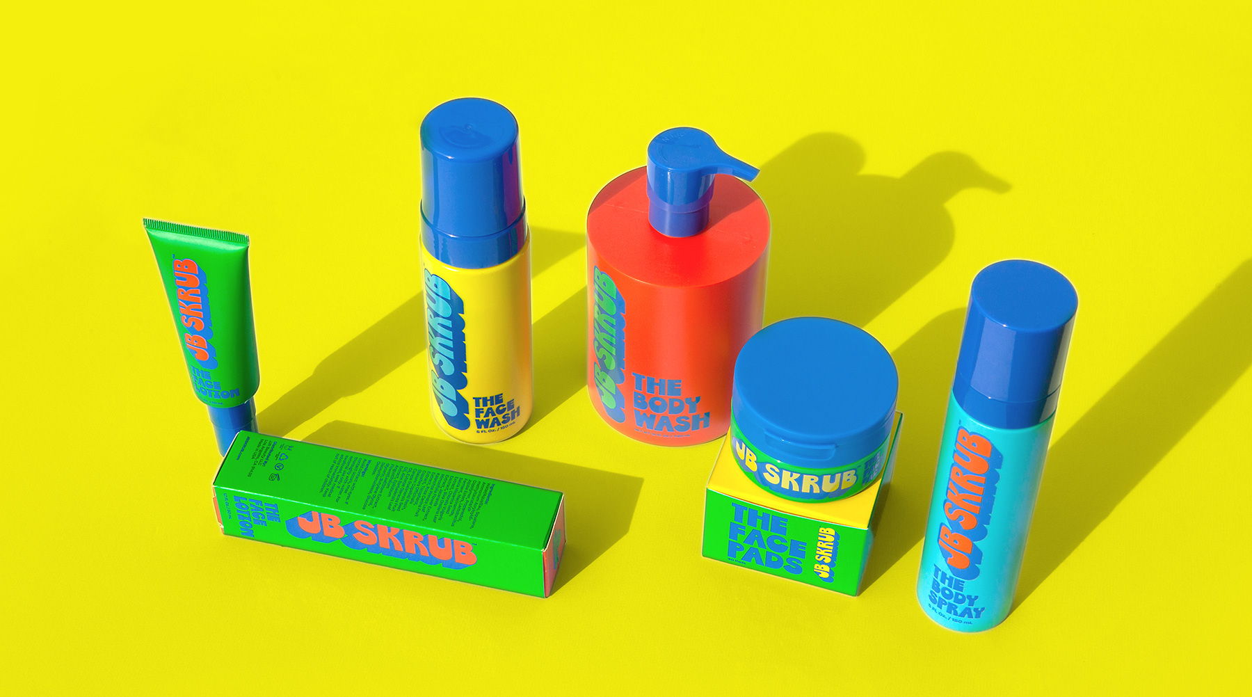
The beauty and skincare world is dominated by products created for women of all ages, but there’s a big hole in the market for pre-teen boys. So ITAL/C designed the packaging for JB Skrub that leans into a visual identity relatable to the pre-teen mindset: a vibrant, cartoon-inspired aesthetic. It’s refreshing to see packaging design understand the market and not force boys to use products that aren’t relatable or suitable but instills the importance of hygiene and self-care at a young age.
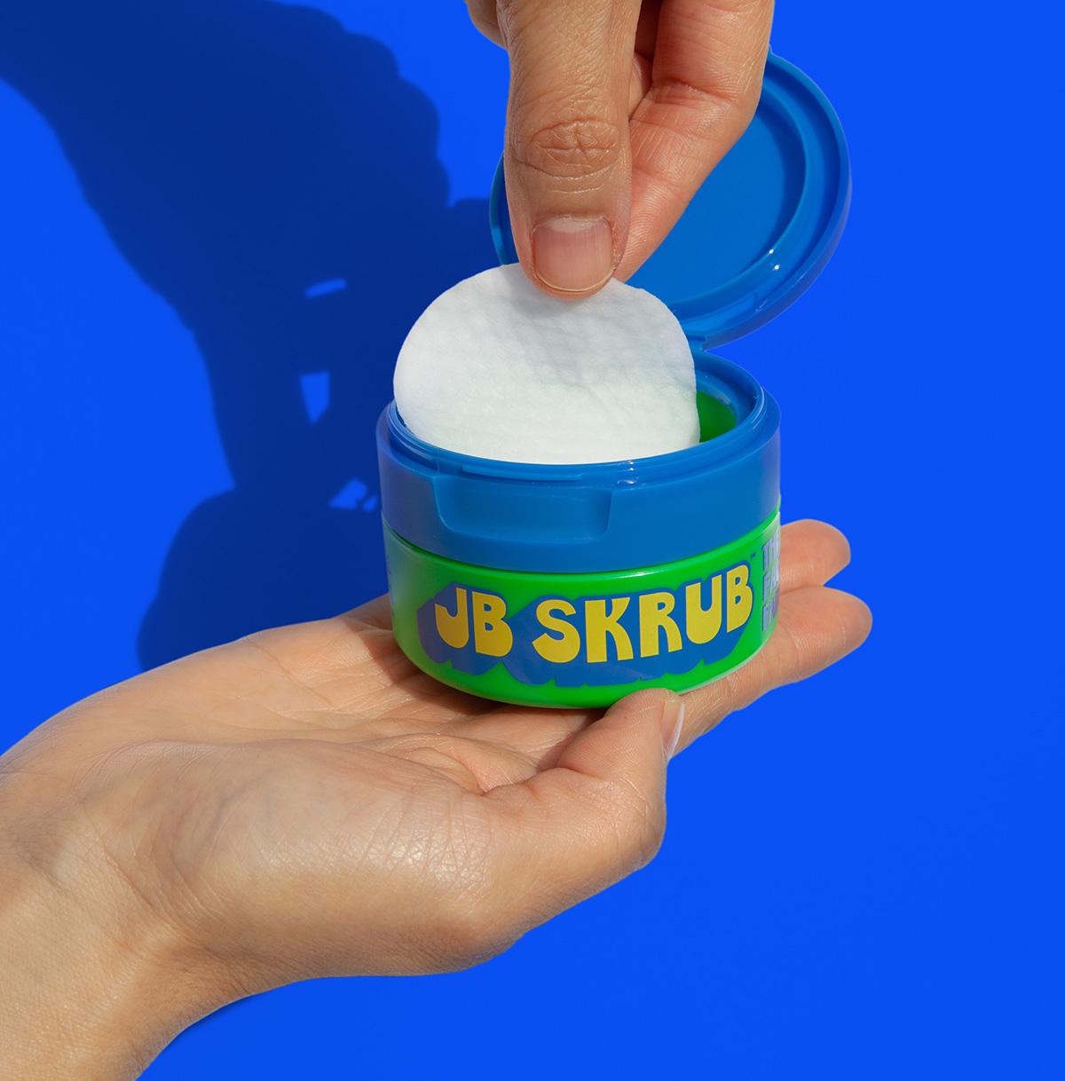
When two moms of multiple boys decided to make a clean line of grooming products that spoke to their nasty pre-teen animals, they called upon us to channel our inner 12 year old and bring JB Skrub to life. We started with a robust naming exercise that incorporated both the founders’ initials: Julie Bowen and Jill Biren. Then created a cartoonish logo which helped establish a bold and vibrant visual identity system, a custom typeface based on the logotype, and package design for five flagship products that were sure to stand out on shelves.


