DIELINE SHOP - ALL HATS 10% OFF THIS WEEK ONLY
Featured image for Ben & Jerry's Founder Launches Cannabis Brand With Design From Pentagram's Eddie Opara

Ben & Jerry's Founder Launches Cannabis Brand With Design From Pentagram's Eddie Opara

by Rudy Sanchez on 04/05/2023 | 6 Minute Read

Ben Cohen is best known for being the Ben of the famous ice cream duo Ben & Jerry’s. But since turning their little ice cream parlor into a global phenomenon, Cohen has moved onto other ventures, mainly focused on furthering social causes and bolstering progressive political candidates like Bernie Sanders.

But for his latest venture, Ben is entering a very different kind of business—legal cannabis. Ben’s Best BLNZ (B3) is a new brand of cannabis with the stated mission of “selling great pot” and then using the power from that business to address the injustices of the war on drugs.
B3_blogpost_23.jpg

All the profits from B3 are split three ways, with 10% going to the Last Prisoner Project, a non-profit working to free and reintegrate those incarcerated for cannabis offenses; another 10% goes towards supporting the Vermont Racial Justice Alliance, an organization that directly impacts and breaks apart the systemic origins of racism in Vermont.

The remaining 80% of B3’s profits will get set aside for grants and low-interest loans for Black cannabis entrepreneurs. The fund is administered by NuProject, whose projects address equity, education, and networking gaps for cannabis entrepreneurs of color.

B3_blogpost_19.jpg
B3_blogpost_20.jpg

“One of the biggest problems is that due to generations of discrimination in various forms, BIPOC people don’t have much generational wealth,” Ben explains. “Start-up companies usually get their initial funding from friends and family, but for many BIPOC people, that’s not an option. The average Black family has one-tenth of the wealth of a white family. So while more and more cannabis legislation has ‘social equity’ provisions that give priority to BIPOC people in granting licenses, the people that receive the licenses don’t have access to start-up capital. B3 is trying to help fill that gap by using our profits for grants and loans.”

B3_blogpost_35 (1).jpg

B3 worked with Pentagram partner Eddie Opara for the brand and packaging design. In line with the mission of addressing racial inequities in the cannabis space, Opara partnered with other Black creatives for the B3 project, including typography from Tré Seals of Vocal Type Foundry and Joshua Darden, in addition to commissioned art from Dana Robinson and Opara.

B3_blogpost_05.jpg
B3_blogpost_04.jpg

“Working and collaborating with other Black designers and artists had a significant impact on the Ben's Best BLNZ project,” Opara said. “It brought diverse perspectives and experiences to the table, which can enrich the creative process and result in more unique and meaningful designs. Additionally, collaborating with Black creatives helps ensure the project's cultural authenticity is maintained as they can offer valuable insights into the historical and cultural significance of the blnz. Finally, working with Black designers and artists created a sense of community and fostered a supportive environment for all involved, which can lead to increased motivation and productivity.”

B3_blogpost_11.jpg

Every element of B3's branding also speaks to social and racial injustices, with a protest signage-inspired visual identity. The US Civil Rights movement inspires fonts like Martin and Bayard, while the font family Eva is a nod to the women’s suffrage movement in Argentina.

B3_HT_1-1536x1536.jpg
BBB_FS_single-4-1-1536x1536.jpg
B3_BS_hero-1536x1536.jpg

Expressive typography is at the core of B3’s visual brand identity. Quotes from Black leaders like Angela Davis and Nelson Mandela and calls for reform are given visual priority and energy by setting type in shapes and motions intended to attract attention as the packaging sits on the counter or other place at home. Copy is sometimes embossed, adding another element to discover.

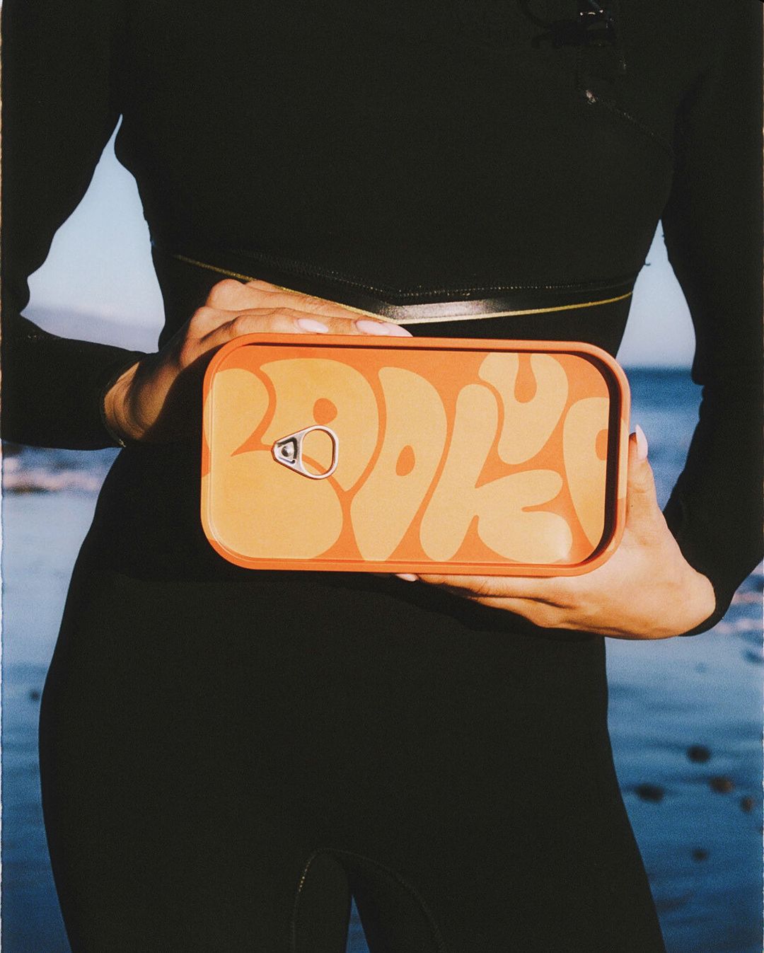
Robinson’s artwork, used on the SloSmokes preroll tin, follows the artist’s Ebony Reprinted series, which takes advertisements from Ebony magazine and reinterprets them devoid of the inherently white, capitalistic, and commercial visual connotations. Robinson chose an advertisement set in an ice cream parlor, a nod to Cohen’s business roots.

BBB_FS_all-effects-2-1536x1536.webp

Eddie’s artwork, used on the vape tins, is a collage of flowers depicting a prisoner in an orange jumpsuit. The use of flowers is a nod to common slang for cannabis, but they were also selected to represent forgiveness, freedom, sorrow, and truth.

B3’s branding and visual identity intentionally avoid cannabis tropes like leaves and the color green. “When we rely on these overused symbols, we perpetuate the notion that cannabis is solely a recreational drug and ignore its many medical, therapeutic, and even societal applications,” Opara says. “Additionally, these clichéd tropes can make it difficult to create designs that stand out and convey a distinct message. By moving away from these tired graphics, designers can embrace more creative and nuanced representations of cannabis that accurately reflect the plant's complex nature and diverse uses.”

B3_blogpost_39.jpg

Using the most sustainable packaging possible was also critical for Ben’s Best. Eddie’s team worked closely with Cohen to use recyclable materials like metal, glass, and paper whenever possible and avoid plastic pouches. Eco-friendly materials aside, it serves another purpose as Cohen and company imagined the packaging as a more artfully designed Dr. Bronner's label that consumers can delight in and explore, something that can be collected and reused again and again. But, given the messaging of the branding, it also becomes a genuine conversation starter that challenges the modern-day cannabis user.

B3_blogpost_25.jpg
B3_blogpost_12.jpg

When asked what the biggest differences between cannabis and ice cream are, Ben says he thinks he went about it “ass-backward.” Cohen said he should have started with the former to create demand for the latter, though he recognizes that the legacy cannabis market still inspired many hungry people.

B3_blogpost_26copy.jpg
B3_blogpost_38.jpg

“Ice cream needs to be kept frozen. That’s a real challenge. Weed only needs to be kept airtight,” Ben adds. “Ice cream is also really heavy—if you make it the Ben and Jerry’s way—and pot is really light. Pot is also really small and also comparatively expensive. So, theoretically, it should be more profitable. But I ain’t seen one penny of pot profit yet, and I’ve seen a lot of theoretical ‘profits’ that never came to pass. But then again, we’re just barely getting our stuff onto the market.”

Ben’s Best Blinz launches in Vermont soon, the same state where Ben & Jerry’s hung up their first shingle, and is online at BensBest.com.

B3_blogpost_15.jpg